"A magazine to be experienced
with all senses"
- Freude. Forever
The Context
In the ever-evolving landscape of digital design, a common challenge emerged: the lack of creativity in online magazines. I found many physical magazines had beautifully structured pages bursting with creativity, however when visiting there websites they lacked the same creativity.
One magazine, Freude Forever stood out, celebrated for its unique essence and creative spirit.
One magazine, Freude Forever stood out, celebrated for its unique essence and creative spirit.
Outcome
Web Design, UI/UX Design
Tools
Adobe XD
Photoshop
After Effects
Duration
5 Month Duration
The Problem
While Freude Forever stood out for its unique print design, its online presence did not reflect this creativity, leading to a significant gap between the physical and digital experience. The original website was not user-friendly and lacked the dynamic, immersive quality that made the magazine special.
This disconnect posed a significant challenge in delivering an inspiring and immersive user experience, that also captured the creativity in the physical magazine.
This disconnect posed a significant challenge in delivering an inspiring and immersive user experience, that also captured the creativity in the physical magazine.
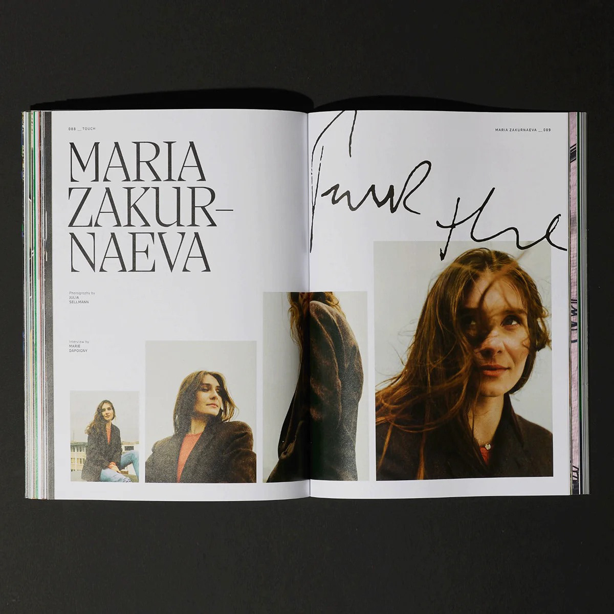
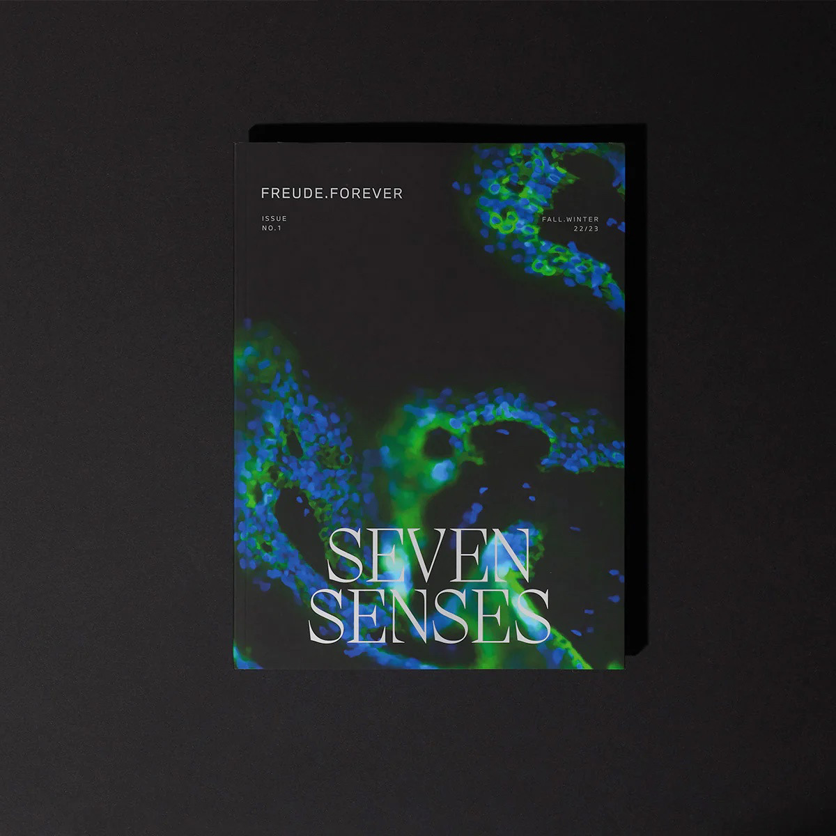
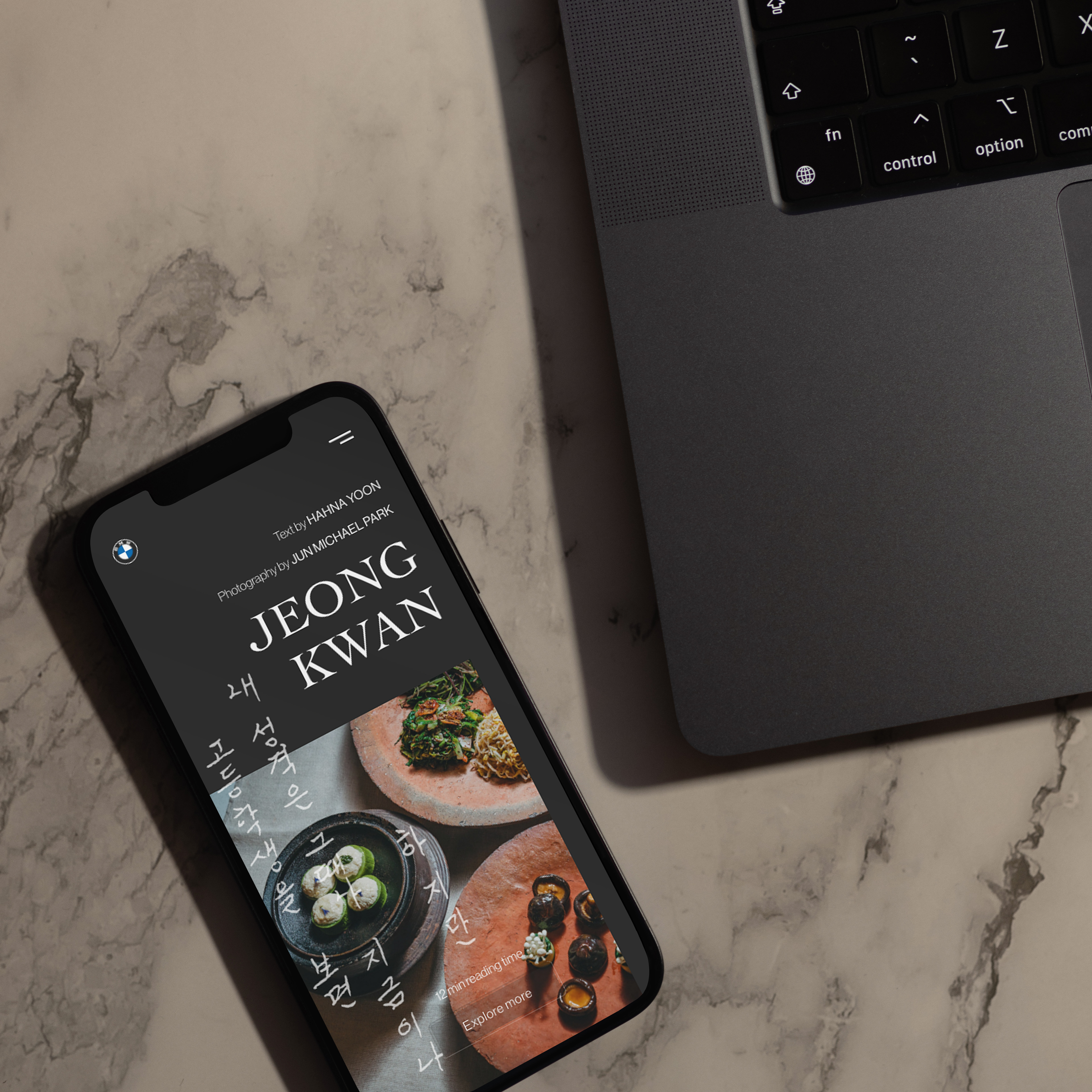
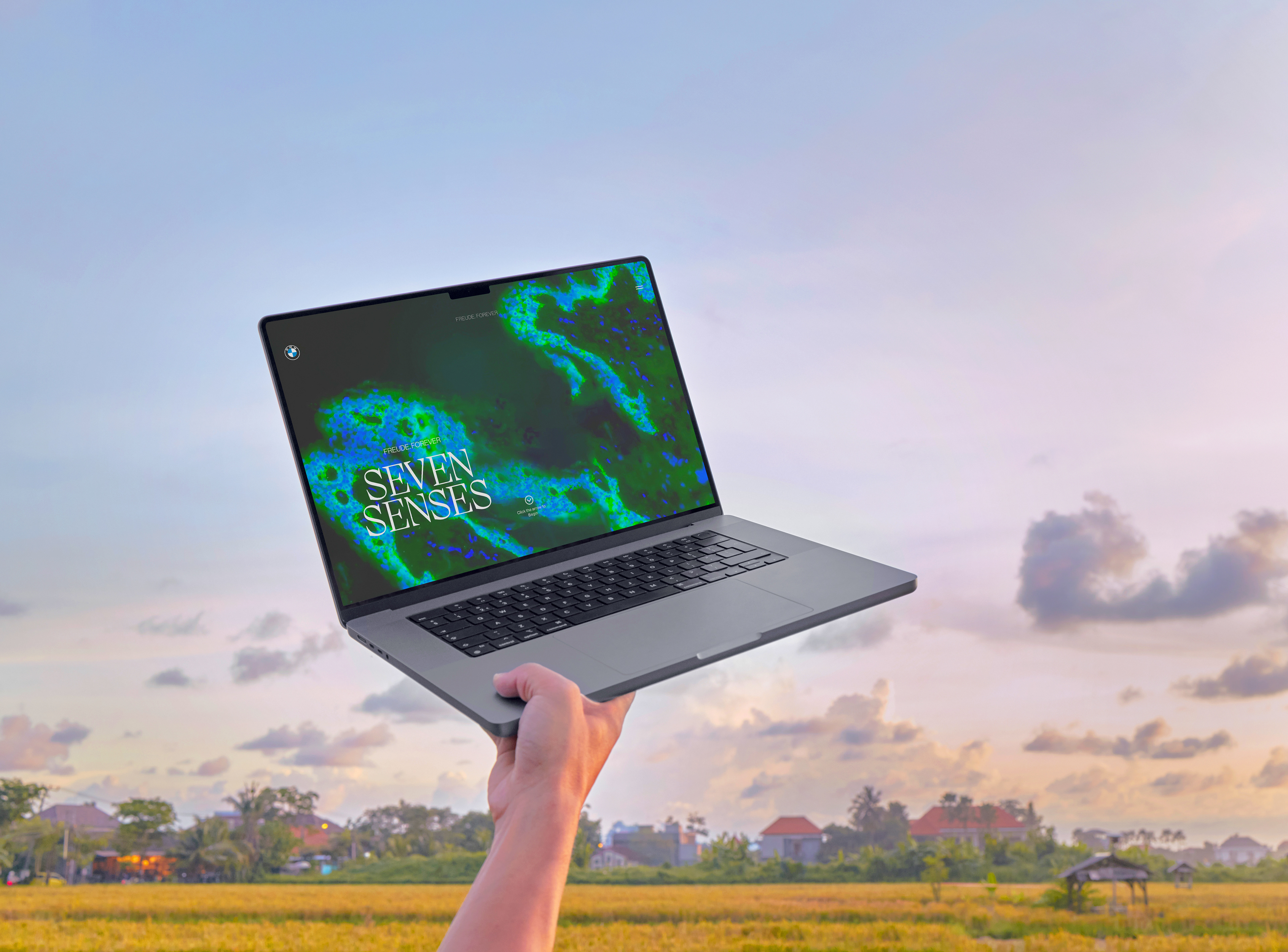
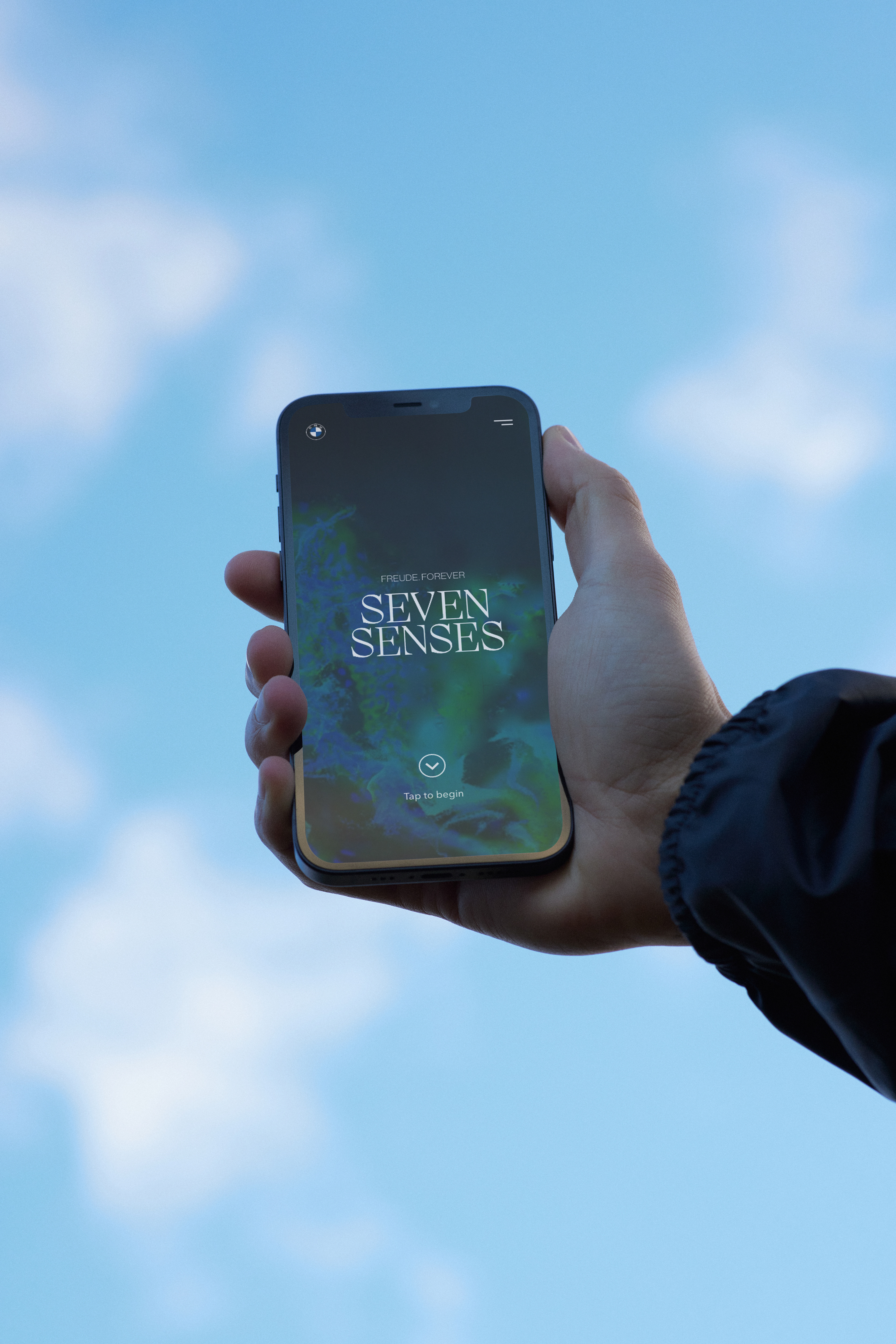
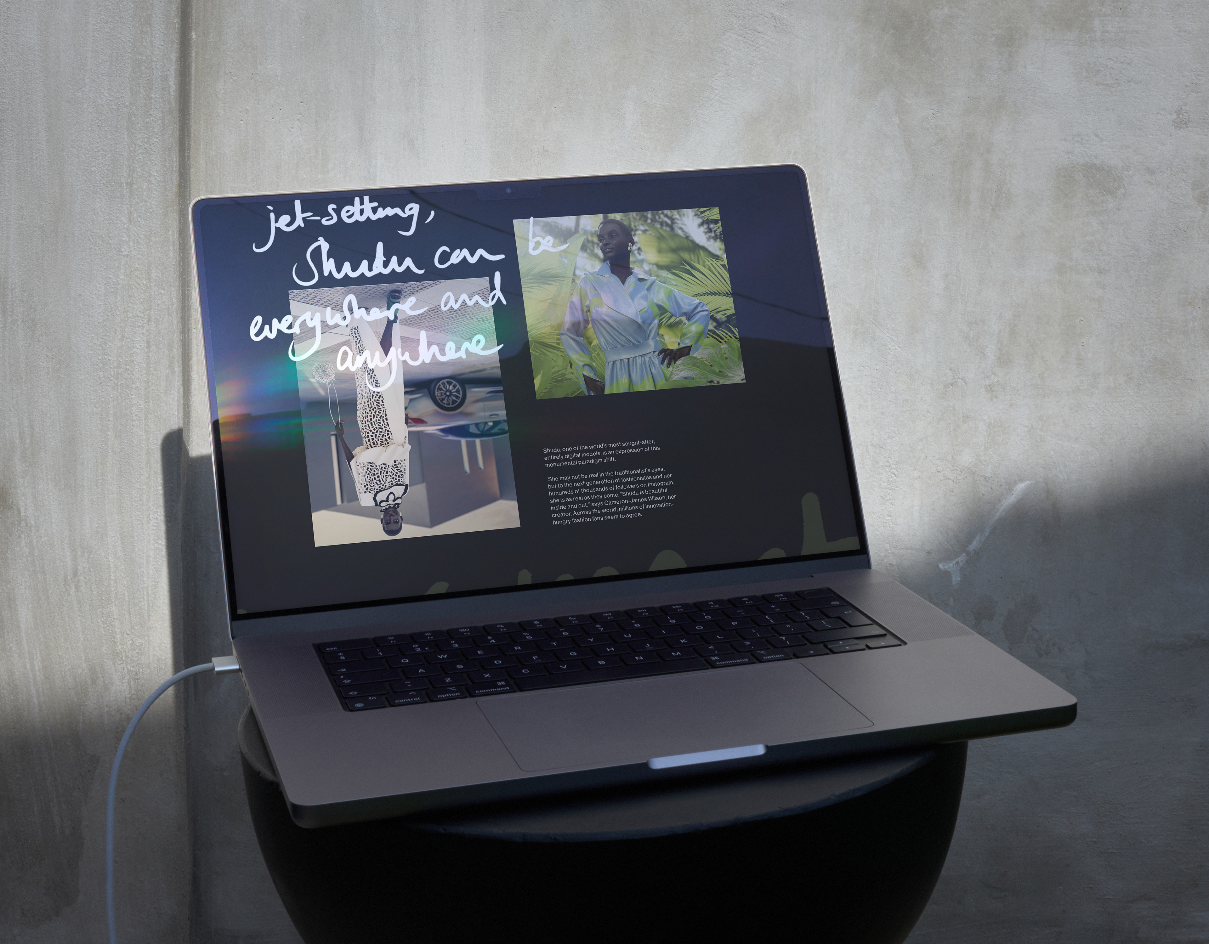
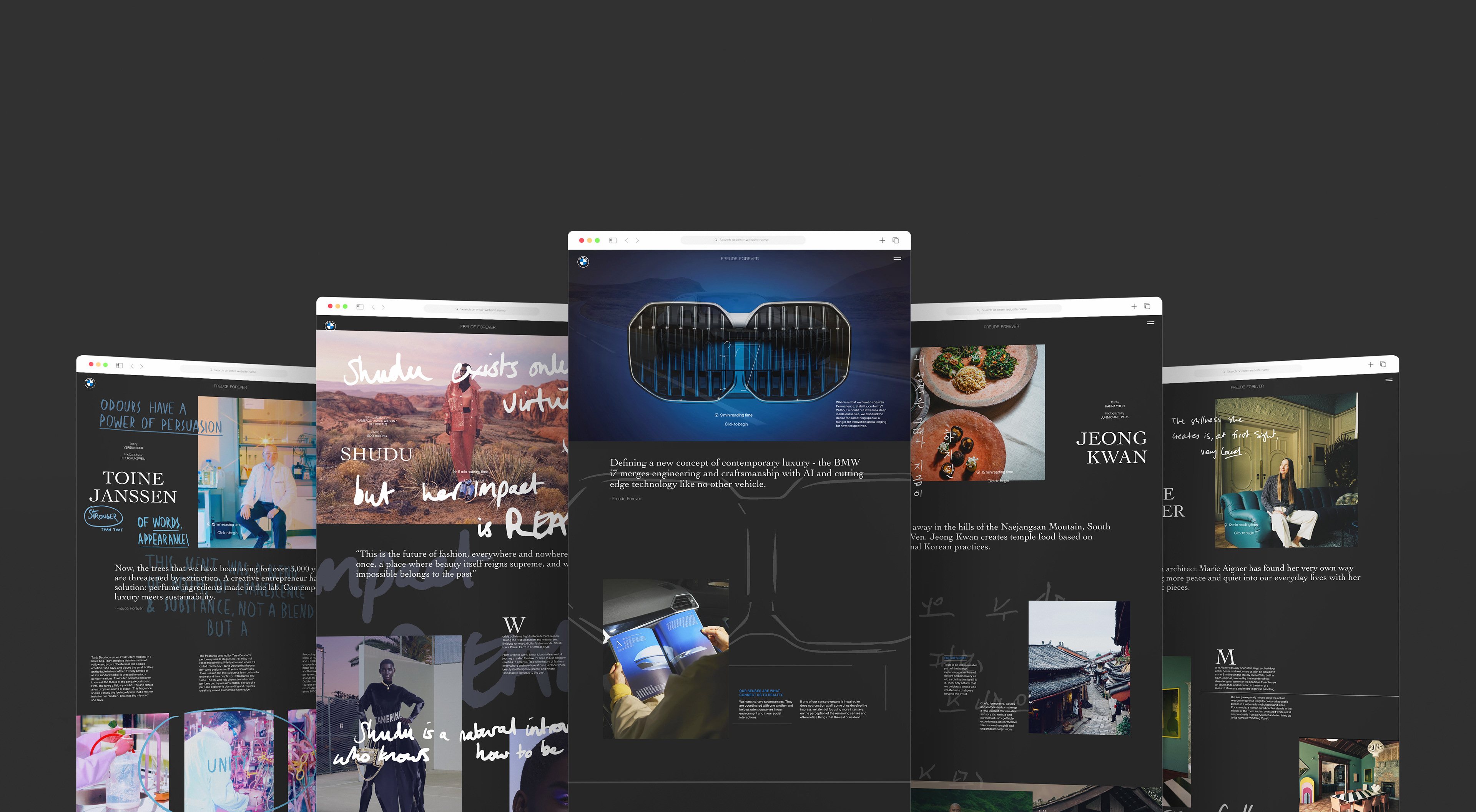
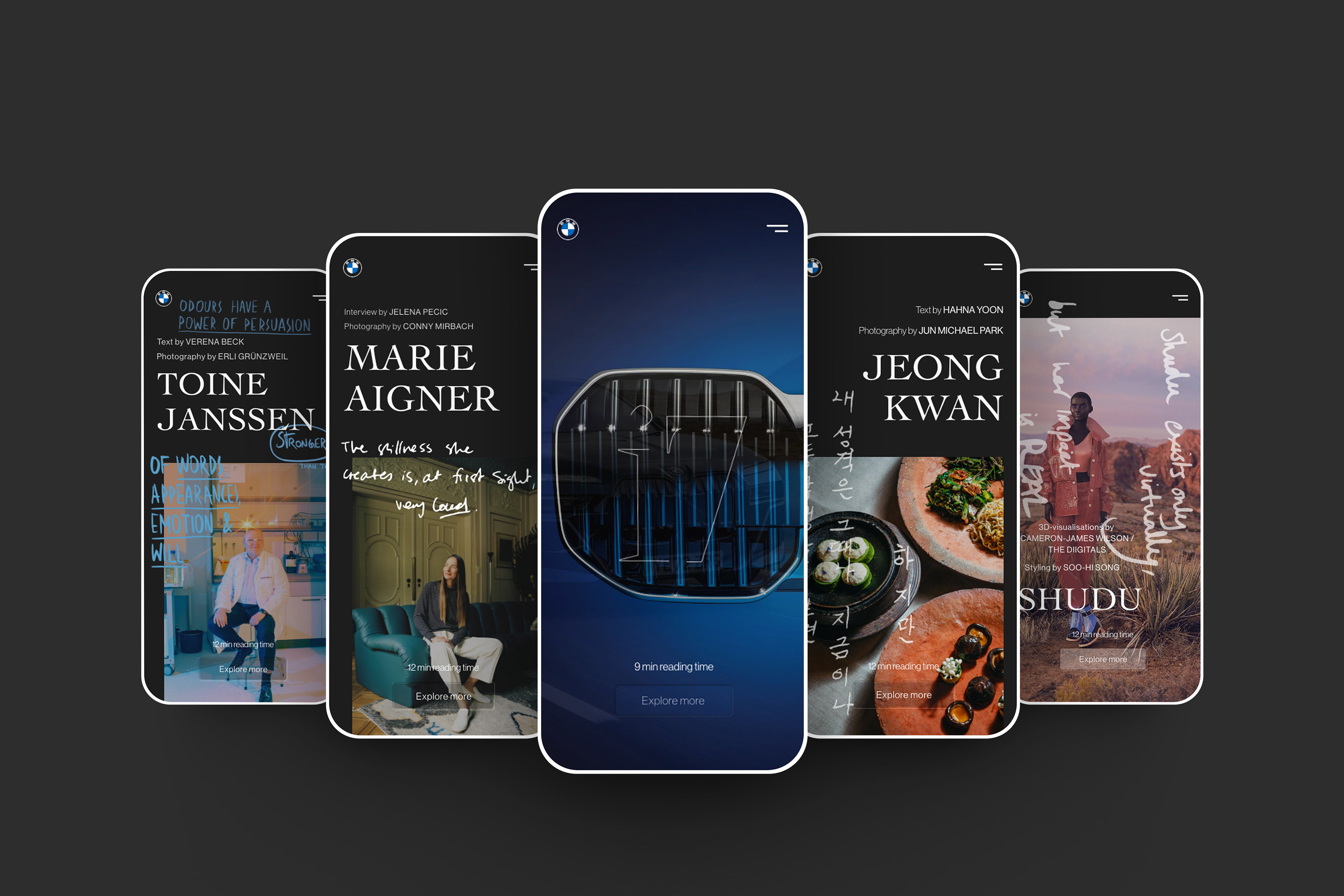
Freude Forever "Seven Senses" magazine
The Solution
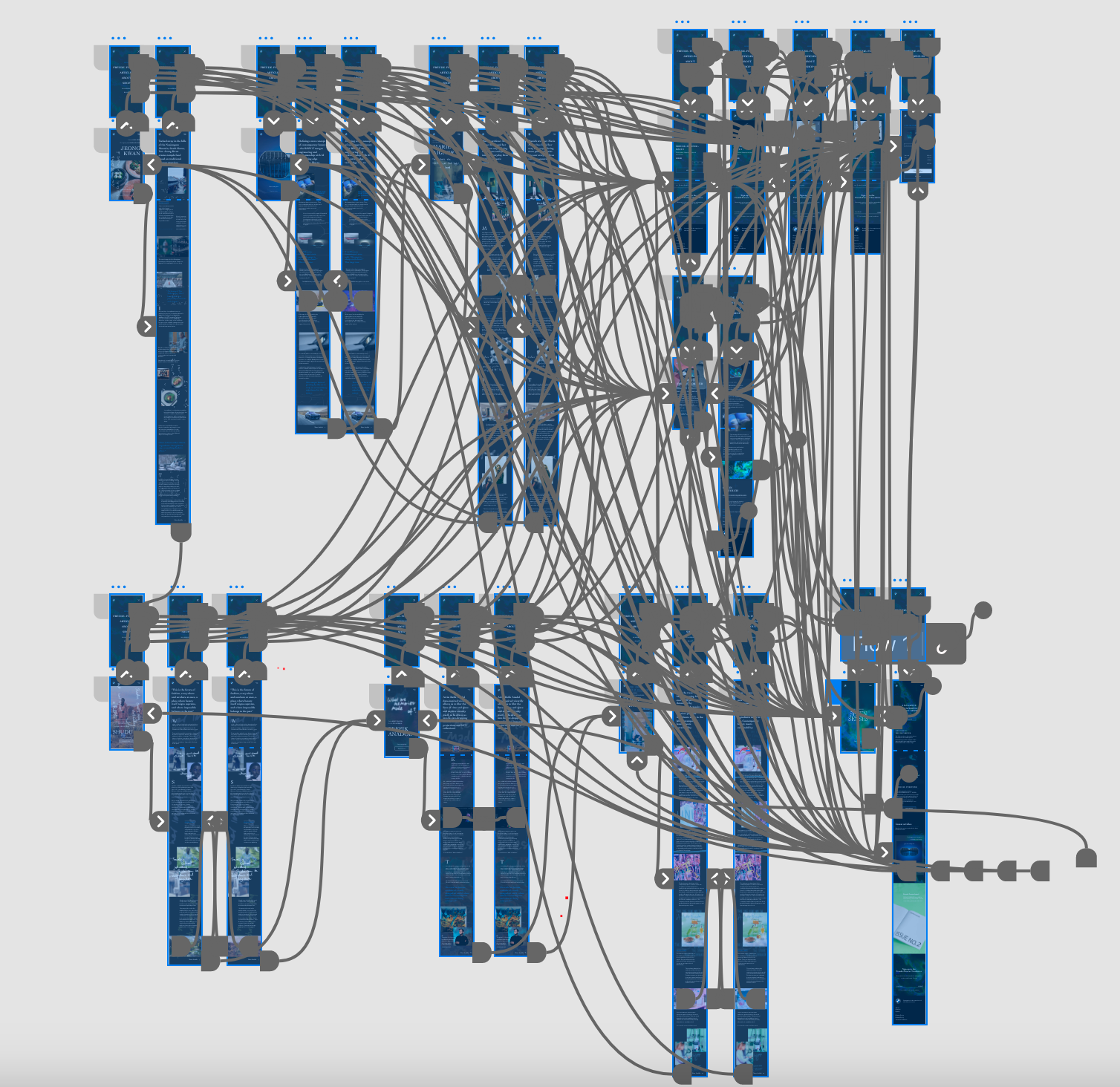
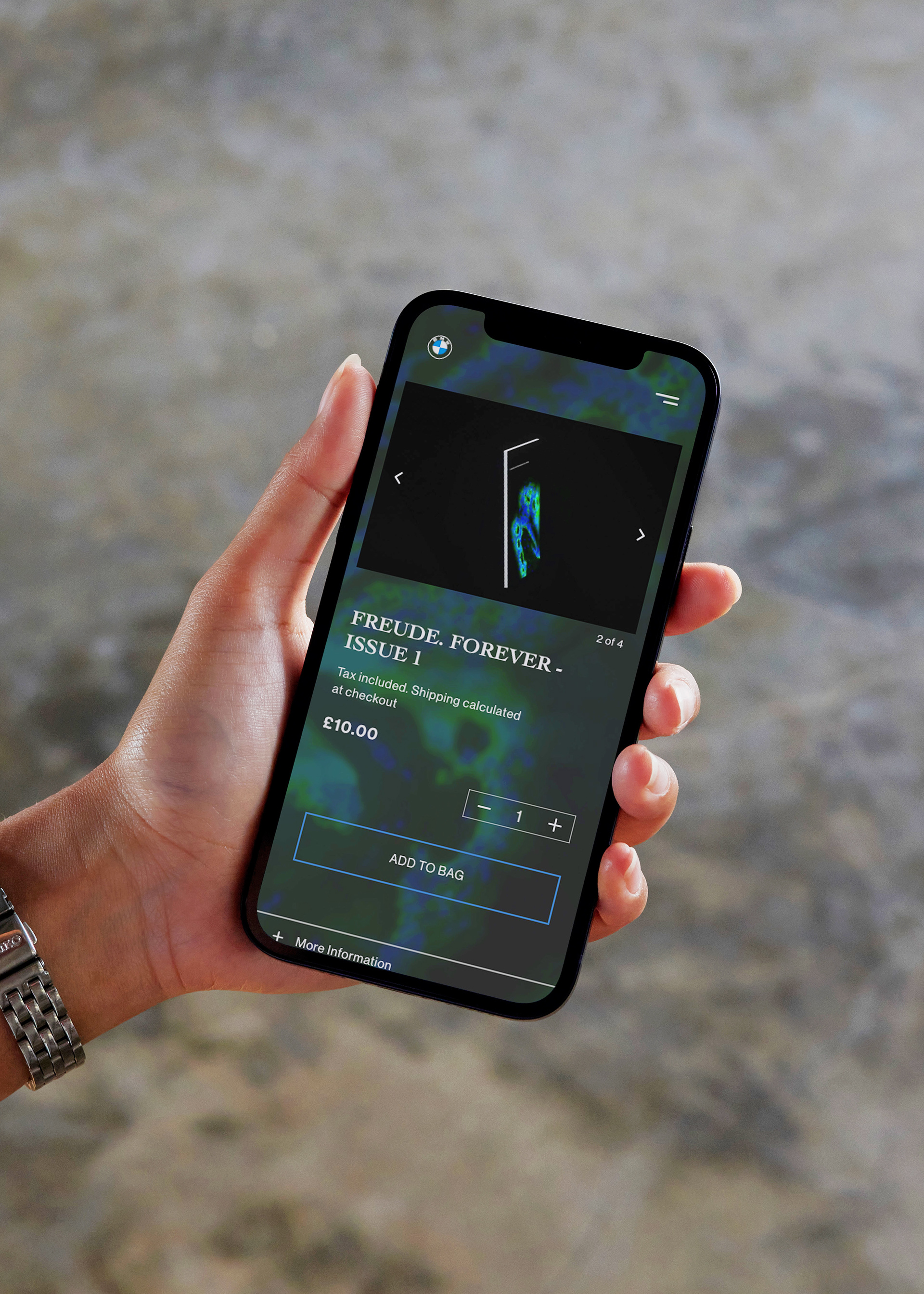
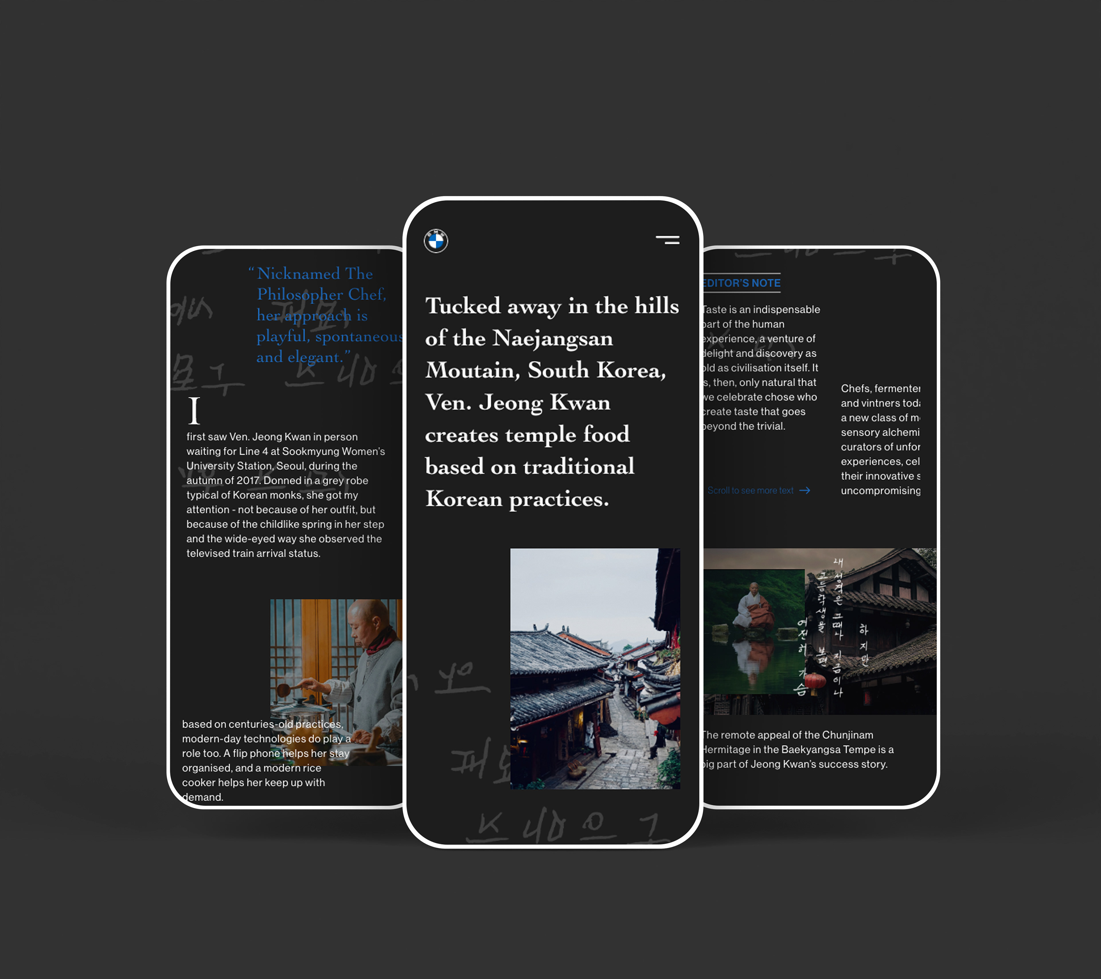
To address this challenge, I employed a meticulous approach, leveraging the power of Adobe XD. I crafted a responsive website that seamlessly encapsulated the creative spirit of Freude Forever, ensuring a captivating experience across desktop and mobile devices. Through bold design choices and intuitive layouts, I transformed the digital realm of Freude Forever into an immersive journey of discovery. Divided into articles, about, and purchase sections, each aspect of the website was carefully curated to reflect the vibrancy and creativity of the magazine.
By redefining the online magazine experience, my solution invited creatives and visionaries to explore, engage, and be inspired by the magic of Freude Forever, ultimately bridging the creative gap between physical and digital design.
By redefining the online magazine experience, my solution invited creatives and visionaries to explore, engage, and be inspired by the magic of Freude Forever, ultimately bridging the creative gap between physical and digital design.
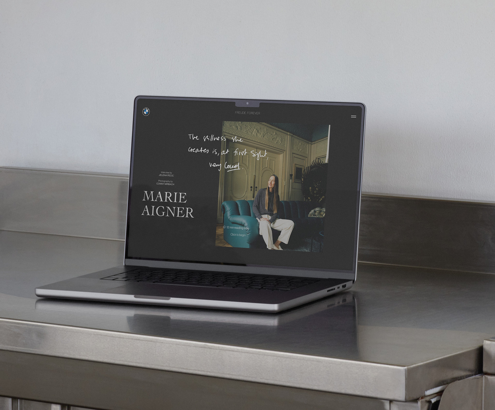
The design for Freude. Forever was heavily inspired by the magazine itself, involving thorough research into various formats, both physical and digital, to shape its design direction effectively.
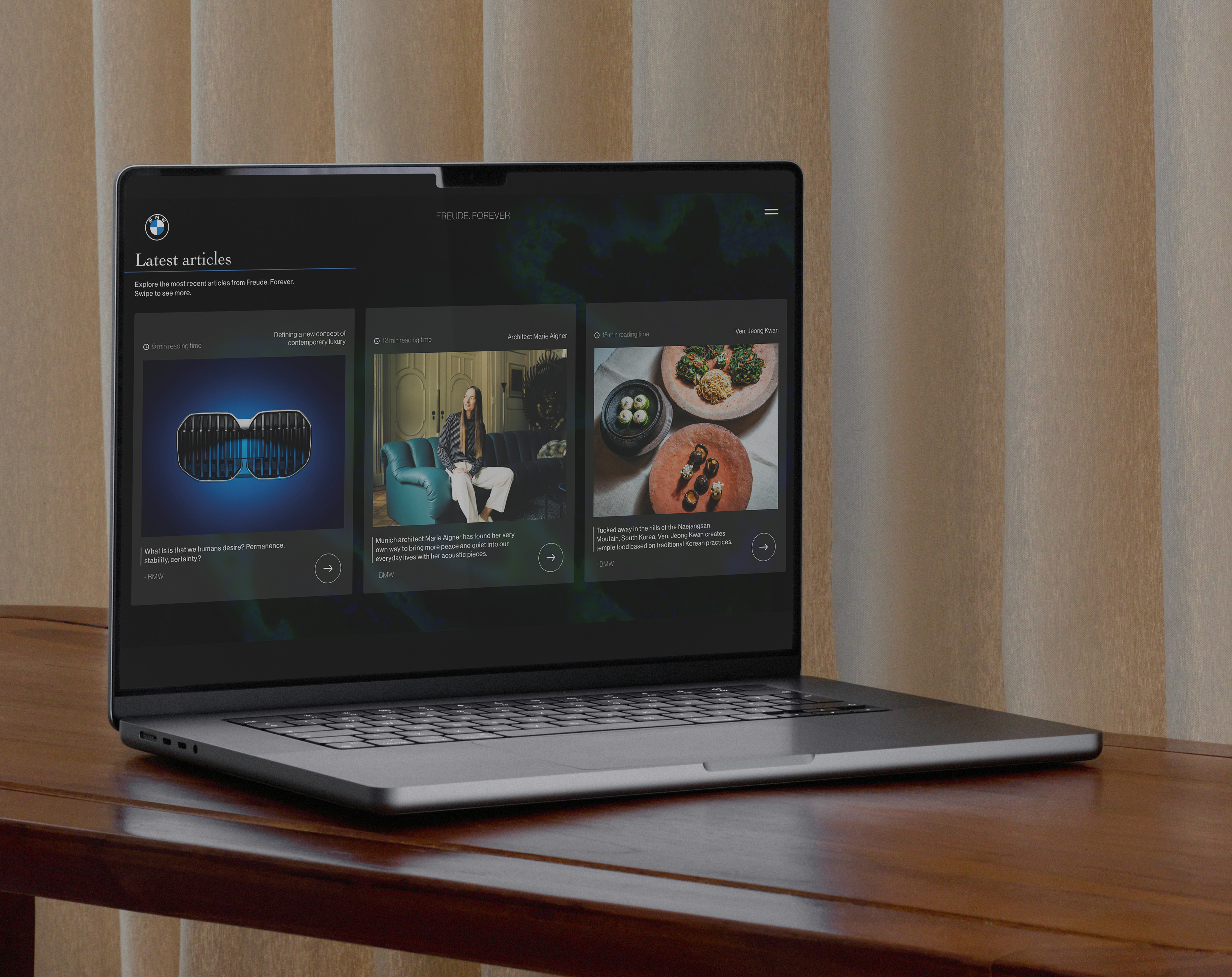
A consistent style was established throughout the website using a defined grid, colour scheme, and typography, mirroring the magazine's aesthetic. This approach ensured a cohesive transition between the physical and the digital.
With a focus on mobile too, I want to ensure that this creativity found within the larger scale of the desktop was just as present with the constraints of the mobile design.
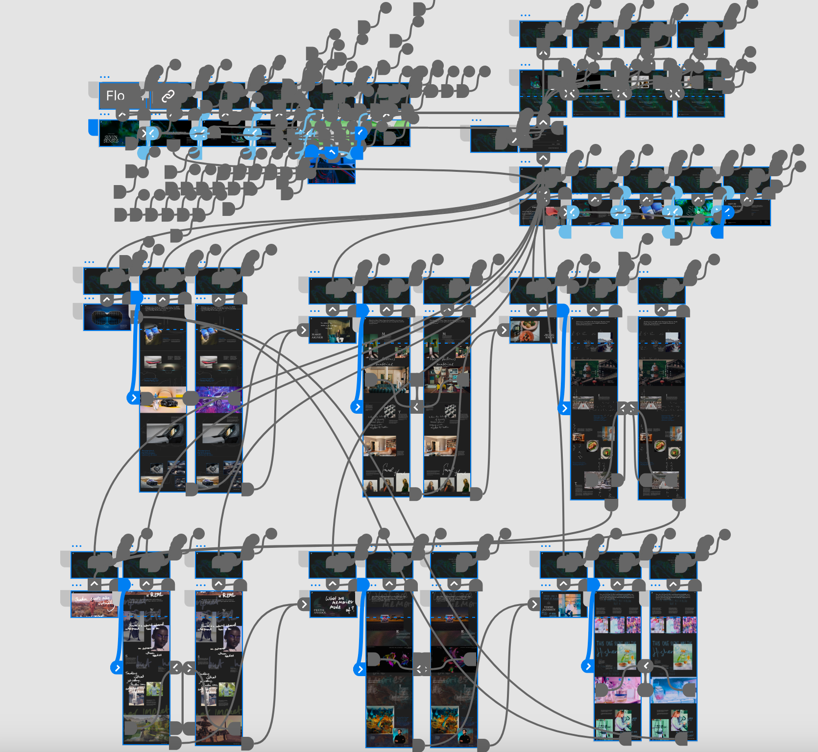
Leveraging Adobe XD's prototyping capabilities, I made sure the design maintained full functionality, offering a realistic preview of how the website's design transitions between pages. This was complete across both desktop and mobile.
Explore the video below for a comprehensive view of the desktop prototype