"Creating a visual experience exploring
the beauty of the Amazon Rainforest"
The Context
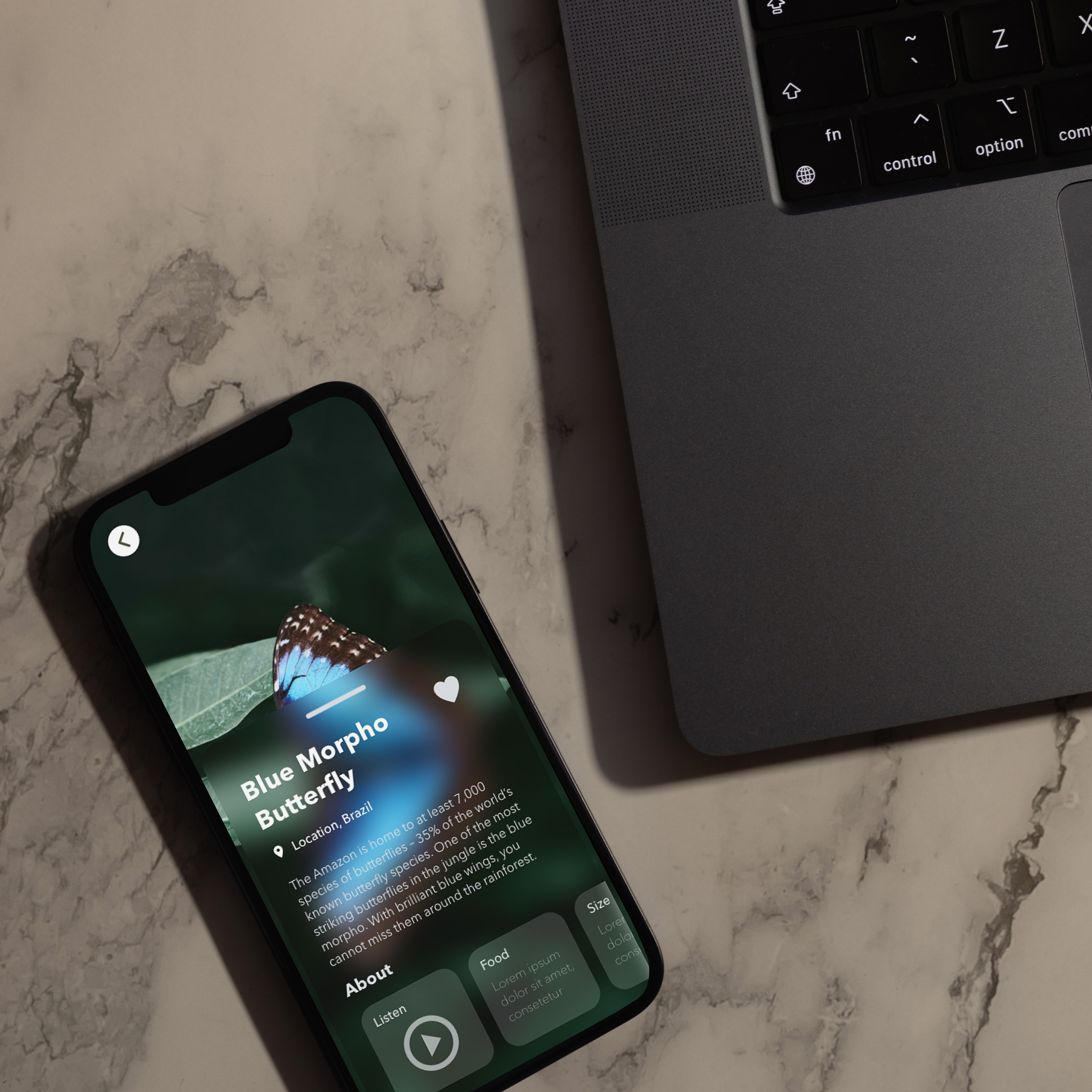
The primary objective of this project was to develop an innovative and adaptable mobile prototype, with a particular emphasis on showcasing the remarkable Amazon Rainforest. The goal was to provide users with valuable insights into the diverse array of features found within the rainforest, including its rich biodiversity, unique flora and fauna, and captivating locations.
Outcome
UI/UX Design
Tools
Adobe XD
Photoshop
Duration
3 Month Duration
The Challenge
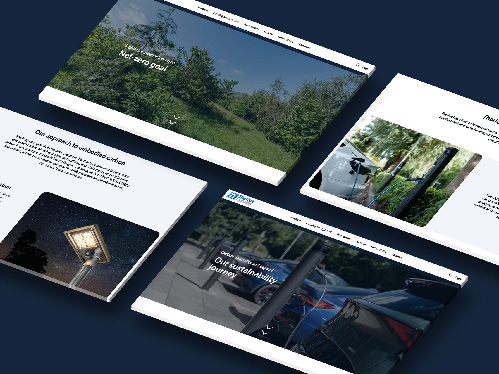
In designing the app, the objective was to capture the Amazon Rainforest's beauty and essence, ensuring user-friendly navigation and interaction. A significant focus was on maintaining a consistent design, especially with a four-colour scheme, to ensure the app's overall cohesiveness. The challenge was to create a standout mobile app that adheres to UI/UX principles, making it not only captivating but also easy to use, emphasizing the Amazon's breathtaking biodiversity.
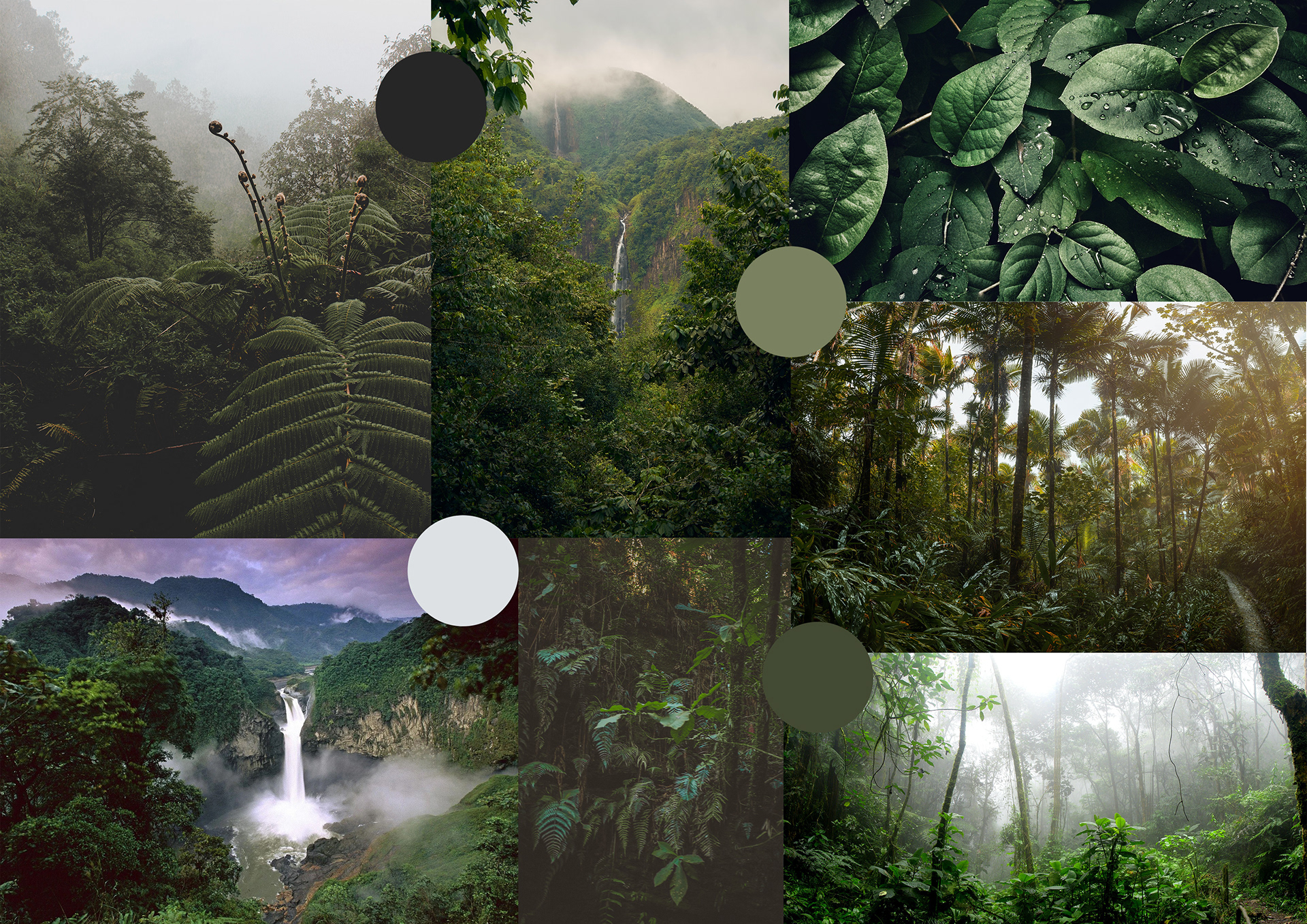
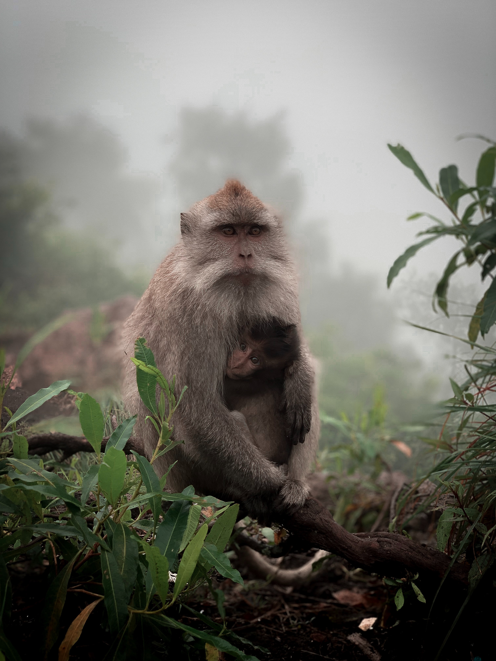
The Amazon Rainforest Inspiration
The Solution
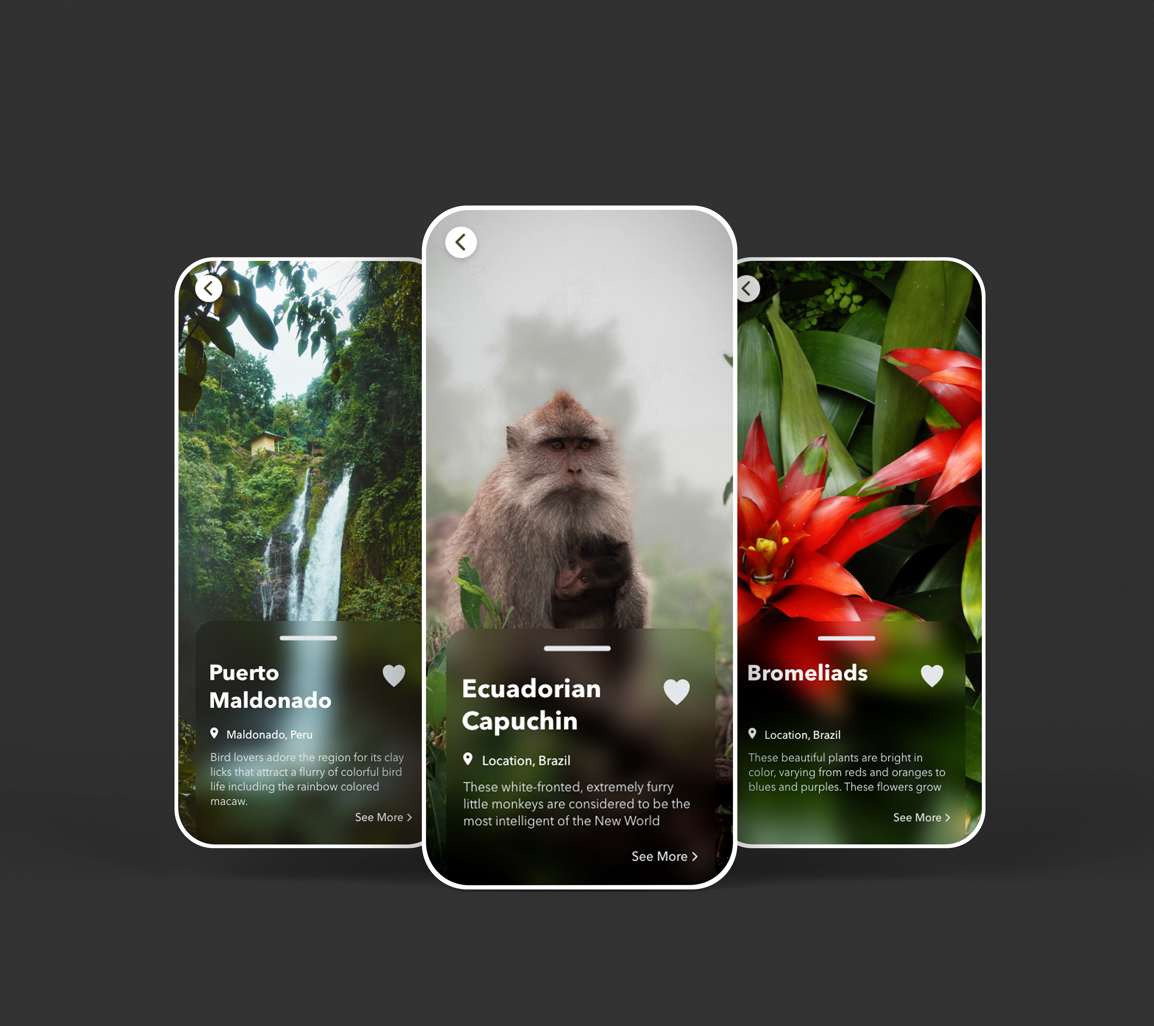
During the course of the project, meticulous attention was given to every design element to adhere to the specific four-color scheme, establishing a consistent and harmonious tone throughout the application. Emphasis was also placed on incorporating captivating photographic imagery within the design to engage users and enlighten them about the captivating beauty of the Amazon.
This approach ensured that the content not only held their interest but also educated them about the remarkable wonders found within the Amazon. The result is an innovative and adaptable mobile prototype that effectively showcases the diverse features of the Amazon Rainforest, providing users with valuable insights and a captivating experience.
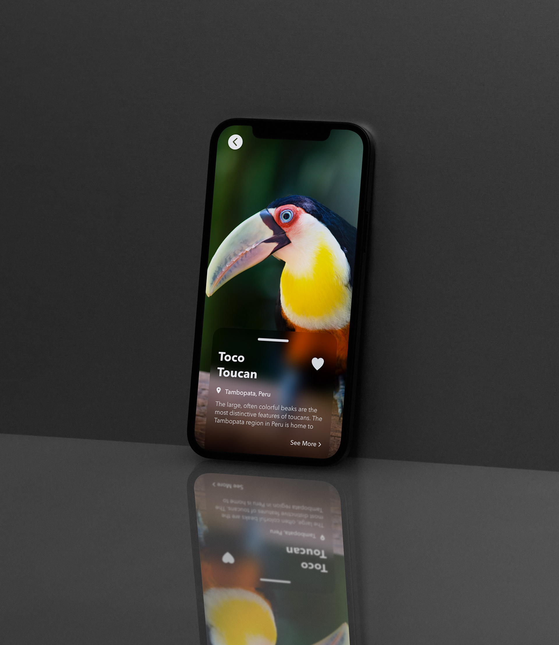
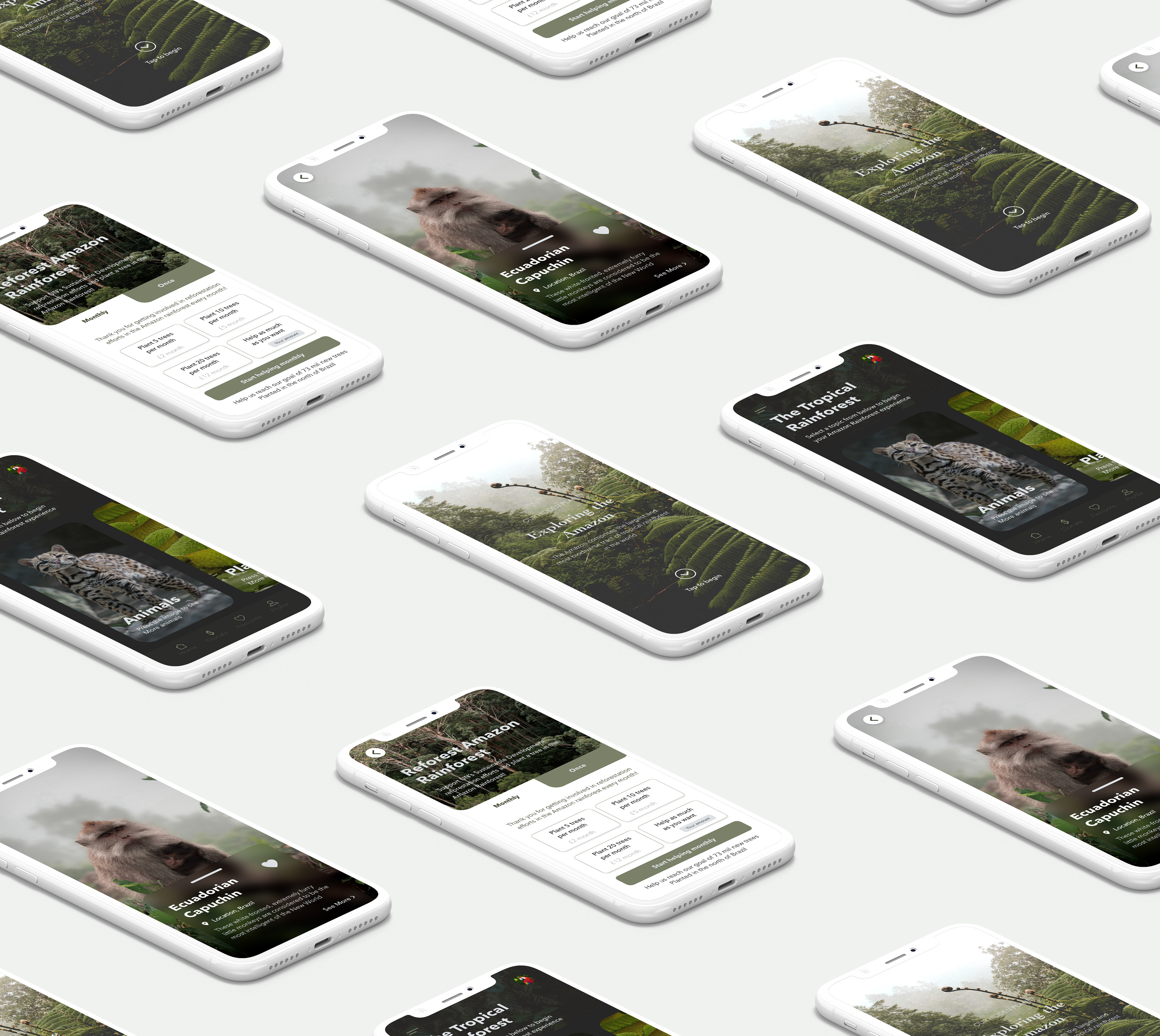
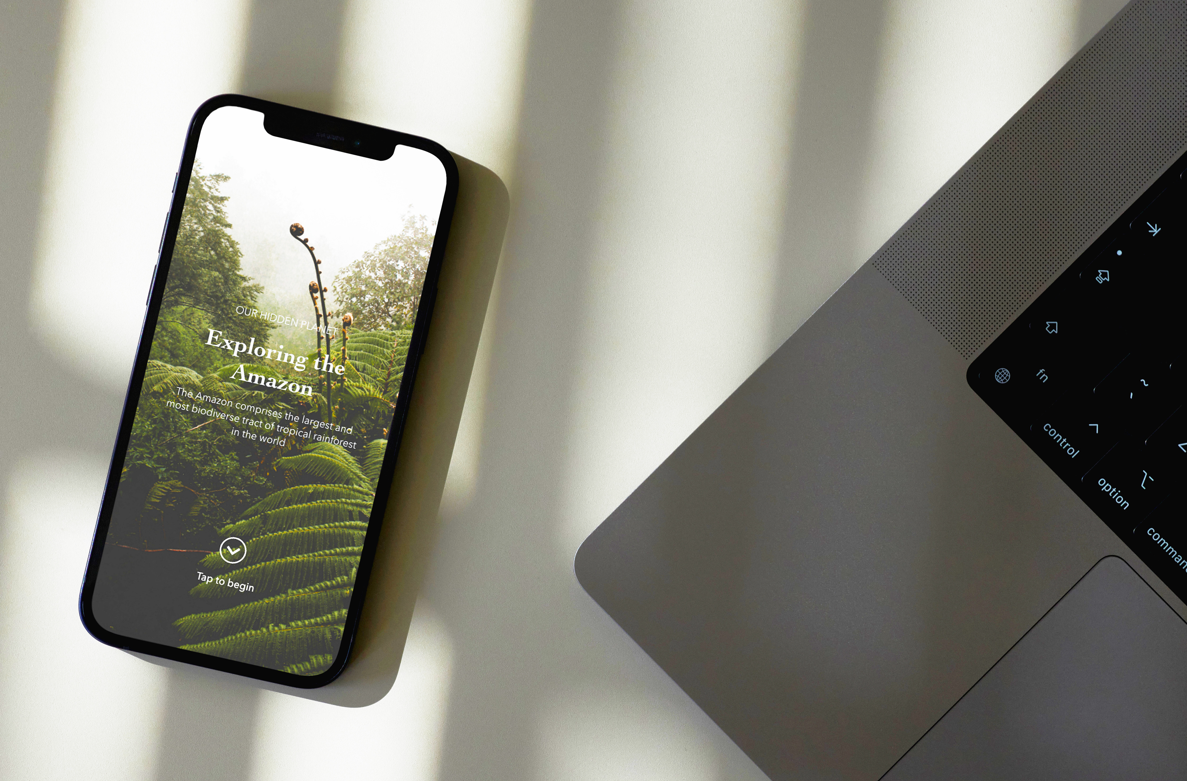
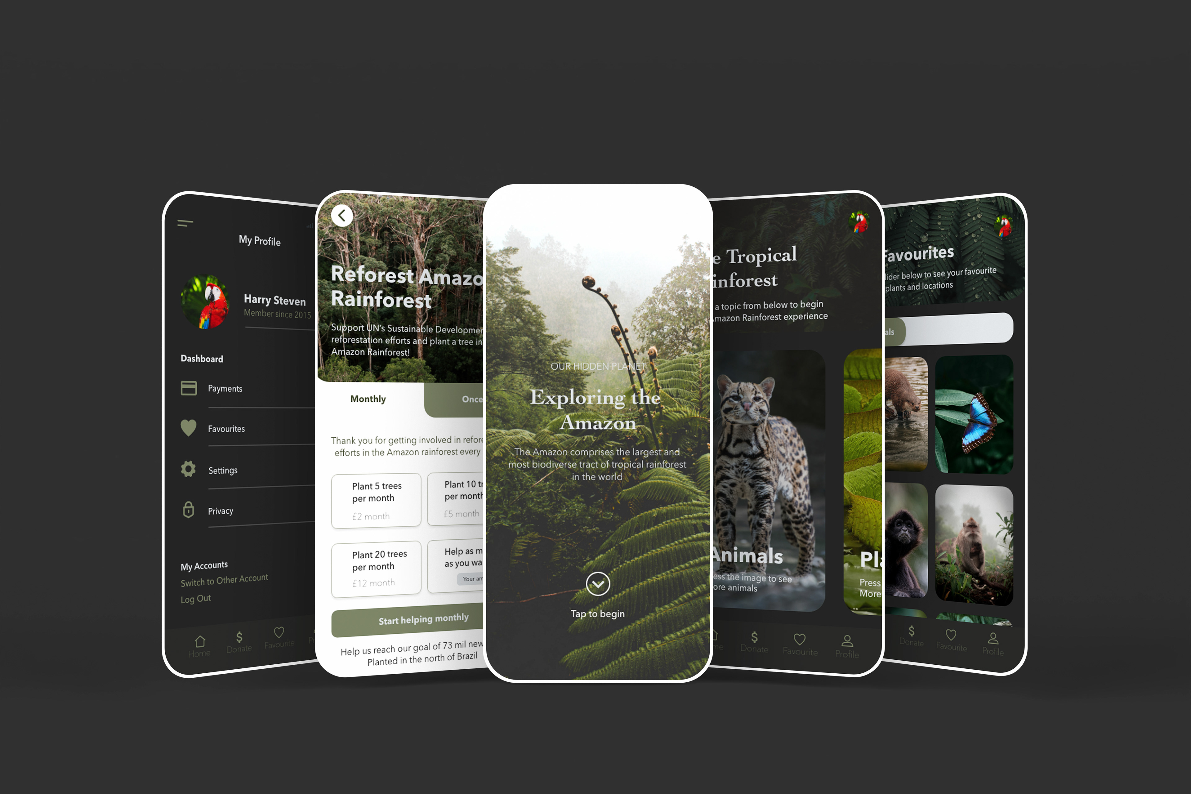
Implementing a structured grid and consistent spacing contributed to a balanced, sleek, and contemporary look for the Amazon Rainforest app.
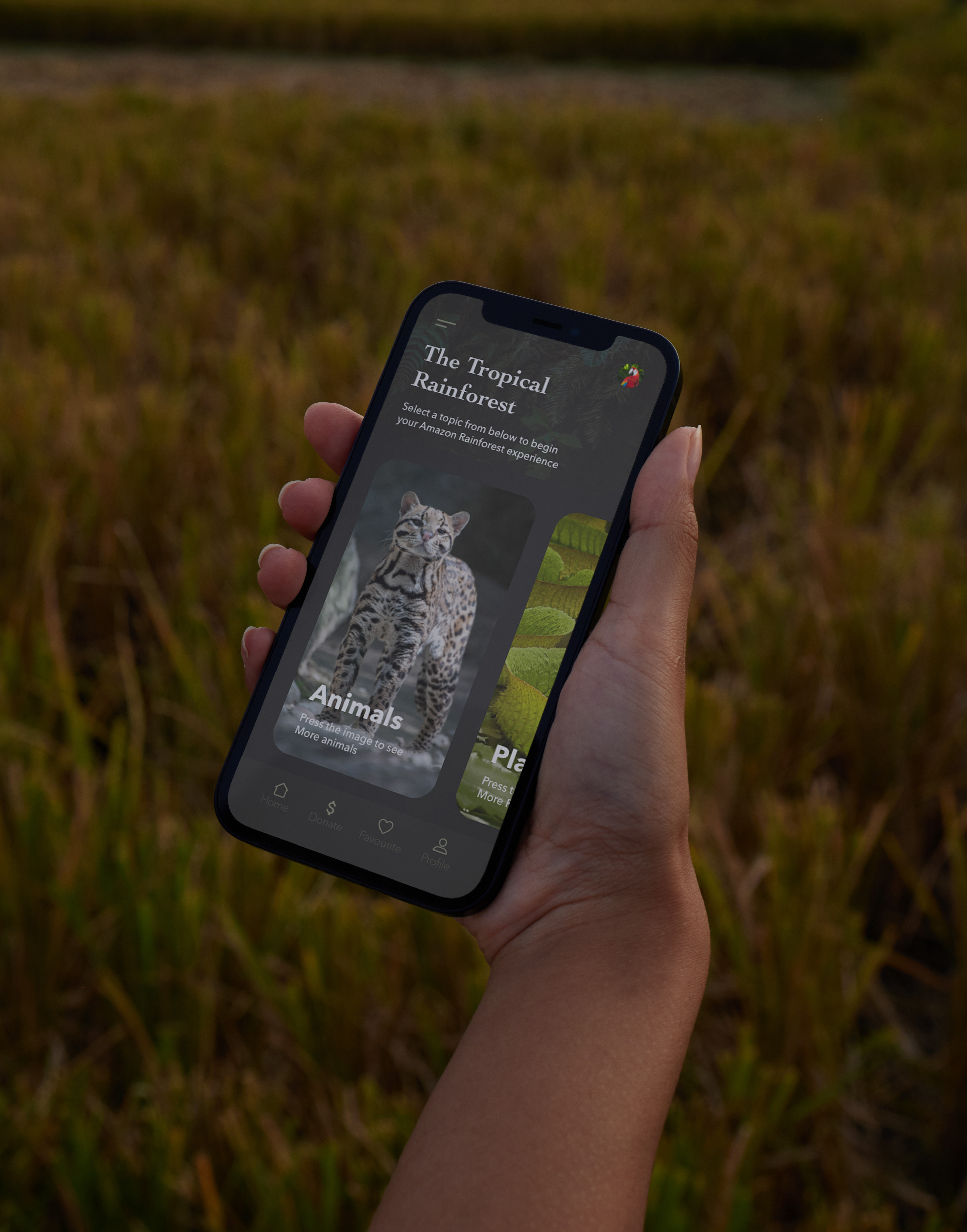
Centering the design around photographic imagery provides a serene user interface, ensuring easy navigation and comprehension of each section for the user.
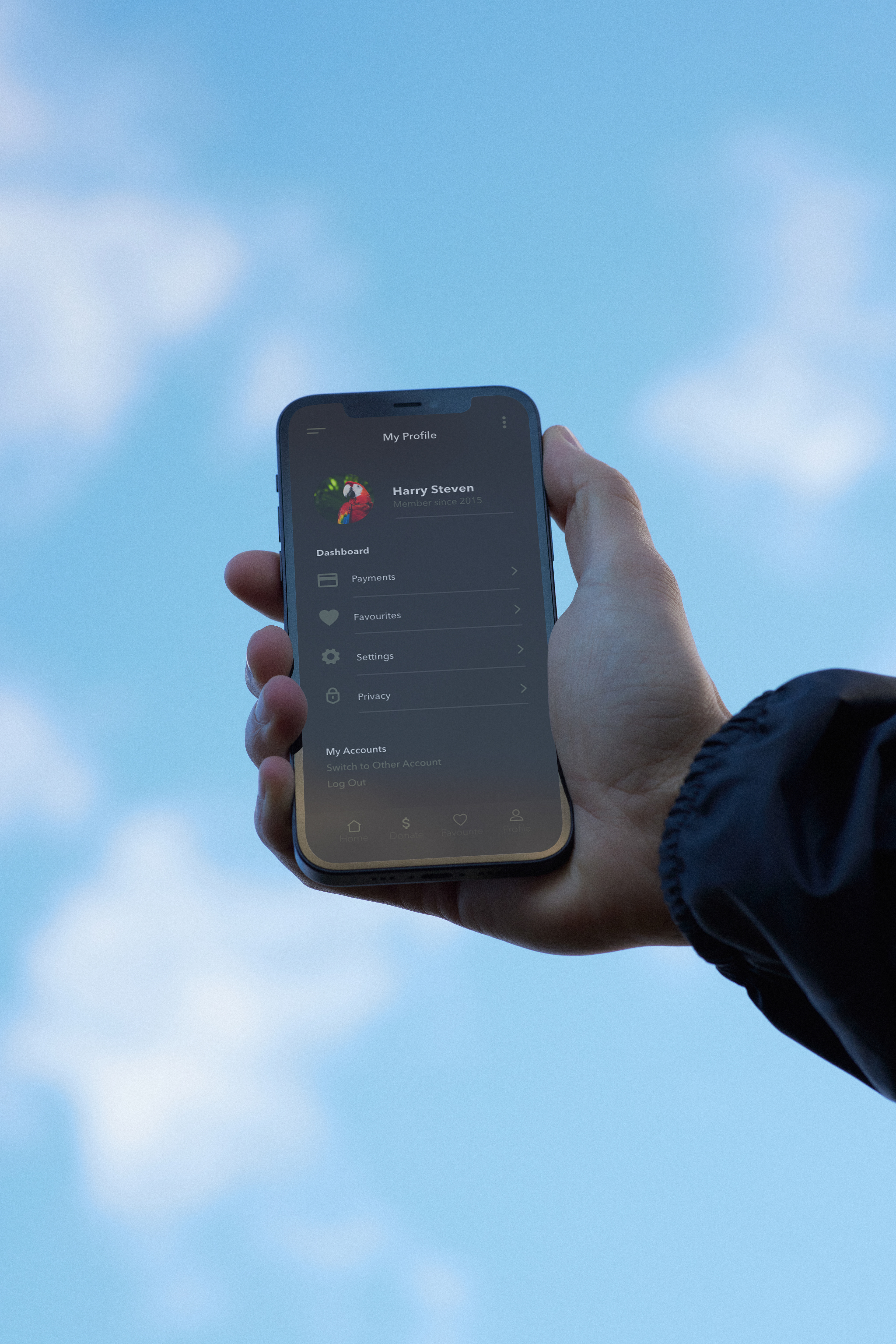
The app's design integrates a "donation" section, offering a formal contrast to its predominantly photographic layout while maintaining consistency with the app’s overall style. This addition enriches the design by offering users a way to engage further with the mobile app.
By utilizing Adobe XD's prototype features, I upgraded the mobile app into a fully functional version, bringing the initial designs to life. This process not only animated the design but also allowed for an exploration of user interactions, including hit points and functionalities, to enhance the overall user experience.
