"Adventur was created to redefine how people experience adventures. By making unique and memorable activities accessible and hassle-free, this project aims to bring unforgettable moments to life for everyone "
- Adventur
The Context
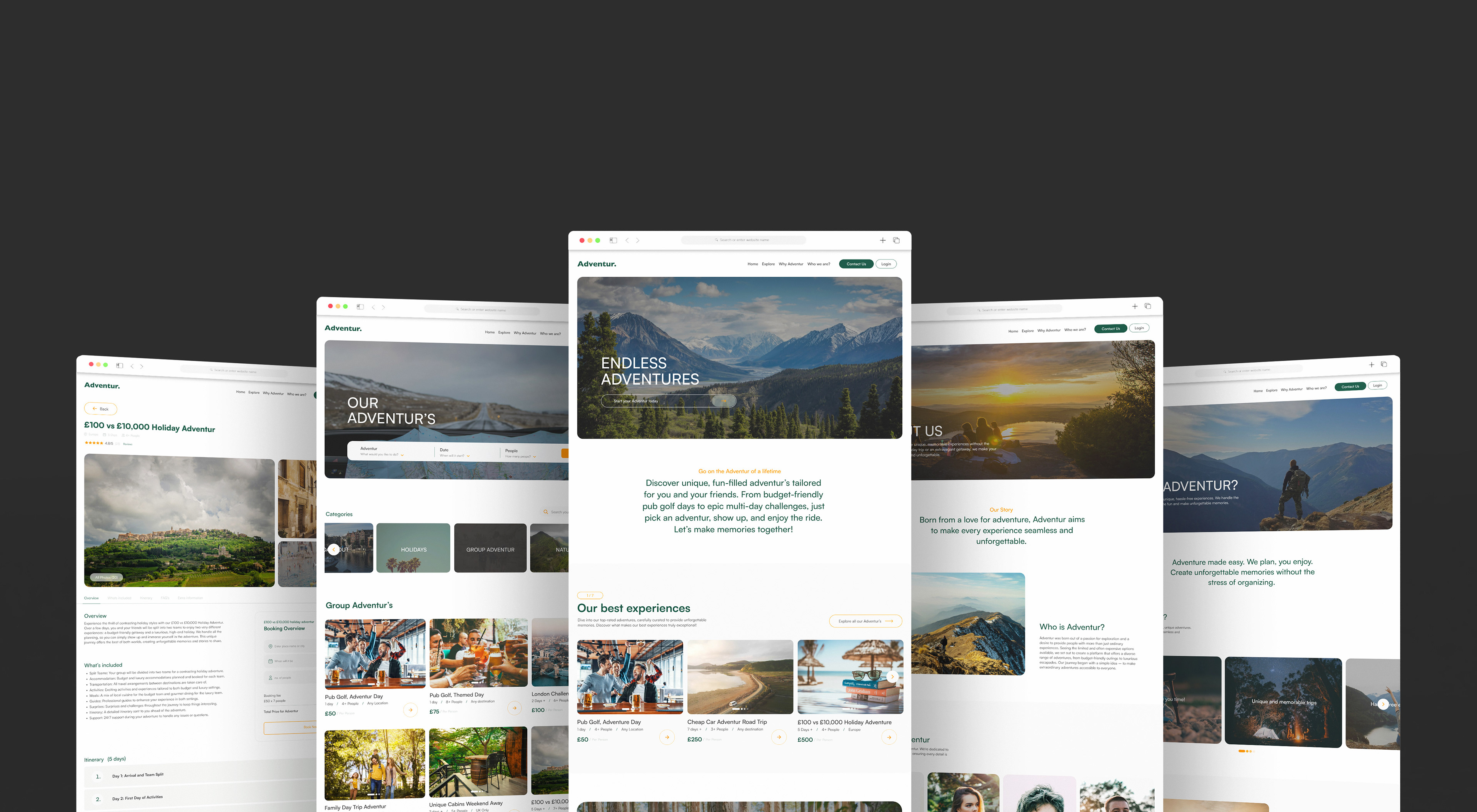
“Adventur” is a new concept that simplifies the process of booking unique experiences. This distinctive desktop and mobile website focuses on the identity of adventure, making it easy to plan and discover unconventional activities.
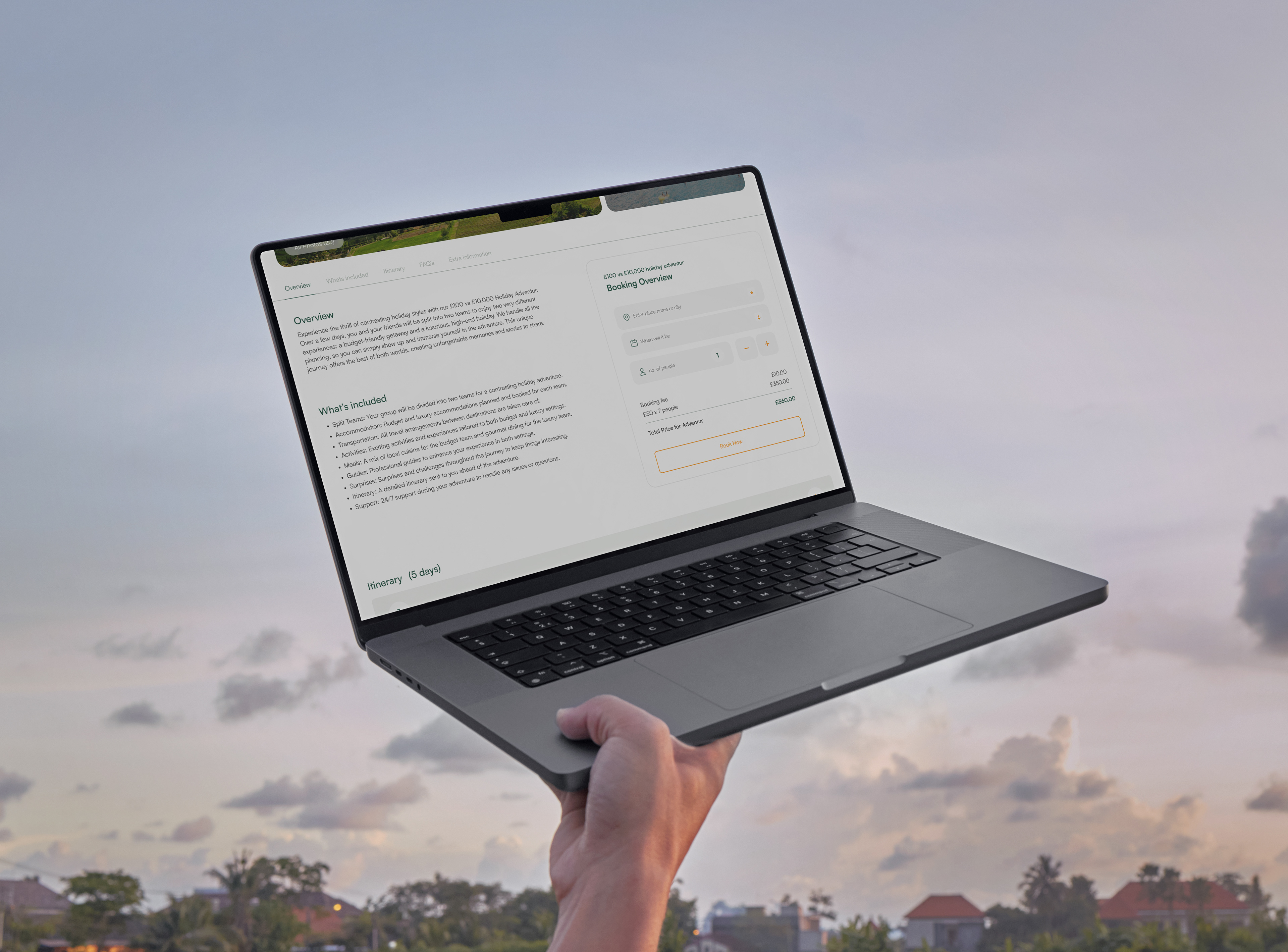
"Adventur" enables users to effortlessly book a variety of adventures, not just holidays, but unique and extraordinary experiences previously thought impossible. With a diverse range of activities suitable for various budgets, from low to high-end, "Adventur" ensures a straightforward booking process from start to finish.
Outcome
Web Design, UI/UX Design
Tools
Figma
Photoshop
After Effects
Duration
3 Month Duration
The Problem
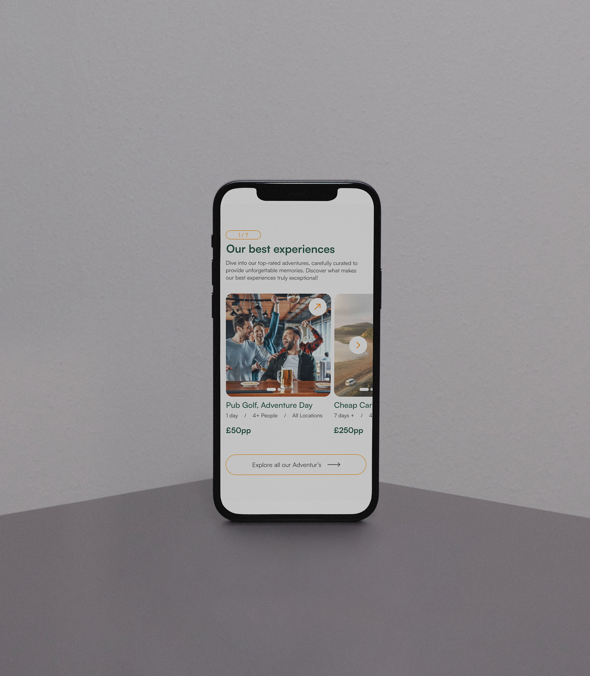
Existing travel and experience planning platforms often face issues such as being overly restrictive or prohibitively expensive, particularly for younger demographics. "Adventur" aims to disrupt this market by offering a wide range of experiences at varying price points. It stands out by providing access to unique adventures that typically require extensive planning, such as the classic pub golf or the YouTube-inspired £100 vs £10,000 holiday.
"Adventur" emerges as a distinctive competitor, enabling users to embark on dream experiences that were previously considered impractical.
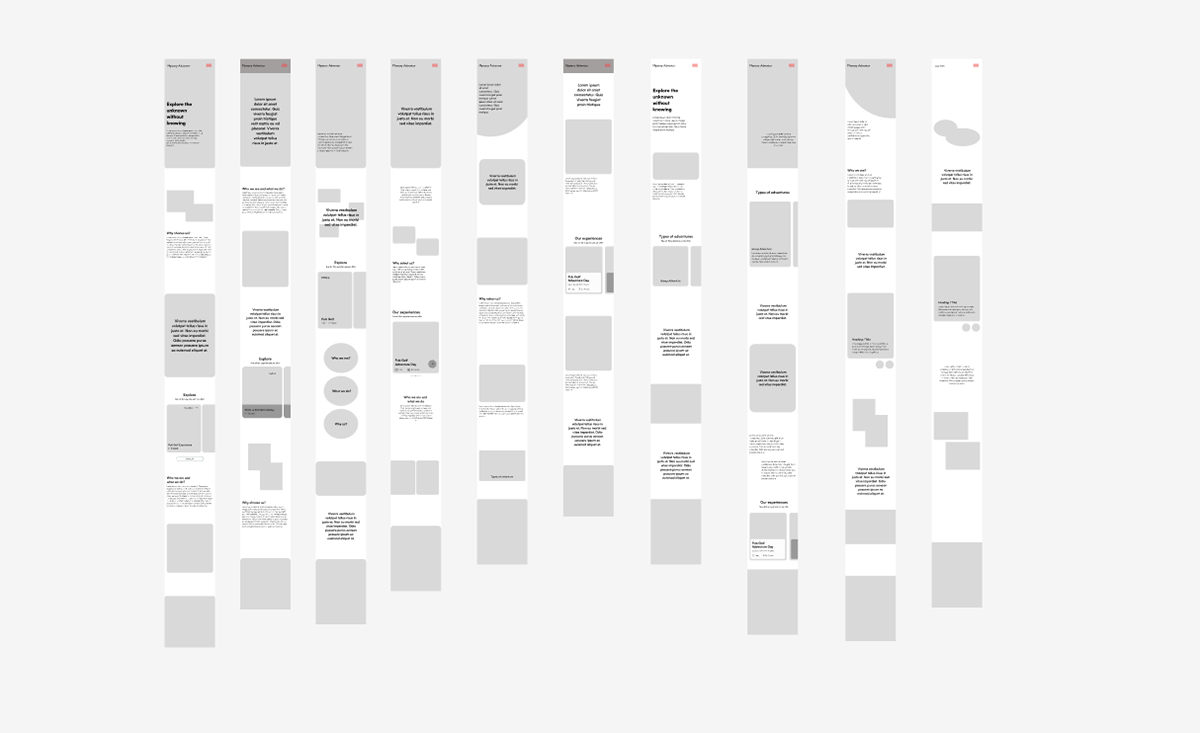
Initial mobile first designs for Adventur
The Solution
To tackle these challenges, extensive research, wireframing, and development were undertaken. The design process began with thorough research into the project's goals, competitors, and sources of inspiration. Adopting a mobile-first strategy ensured usability and accessibility, making it easier to scale to desktop while maintaining user-friendliness. Targeting Gen Z, the design incorporated a cohesive style and minimalistic approach to enhance user experience. Utilising Figma, a series of pages were created with simplicity and functionality at their core. The design features significant white space and a clear grid structure, ensuring ease of use and a bold presence in the competitive travel market.
Continuous evaluation and iterations, from sketches to Figma prototypes, refined the design to meet the expectations of the target demographic, ultimately delivering a successful and user-friendly solution for "Adventur."
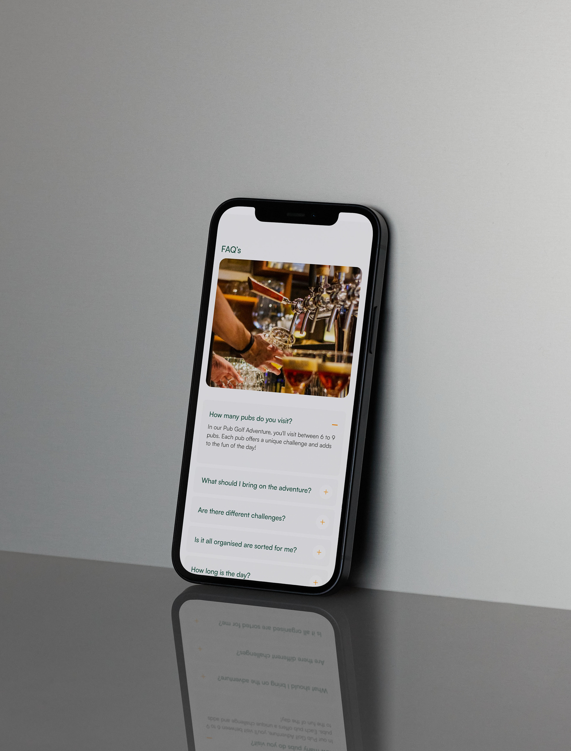
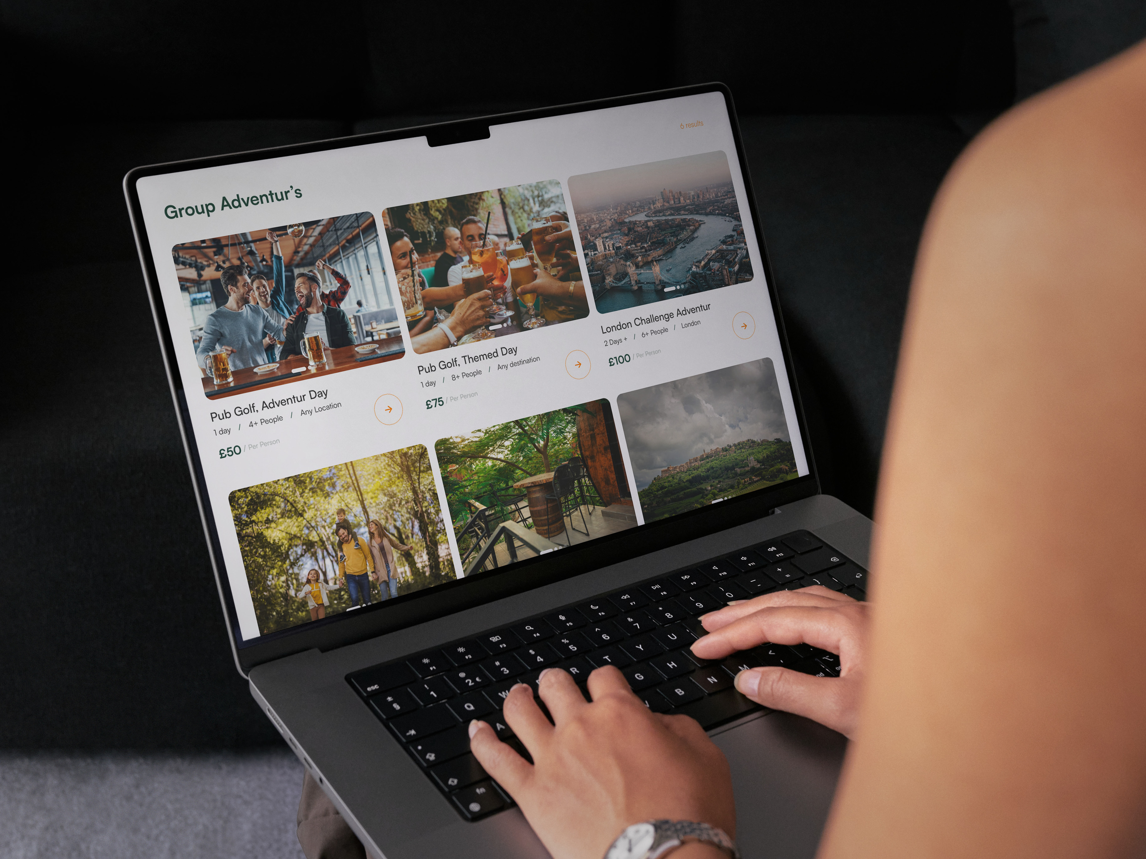
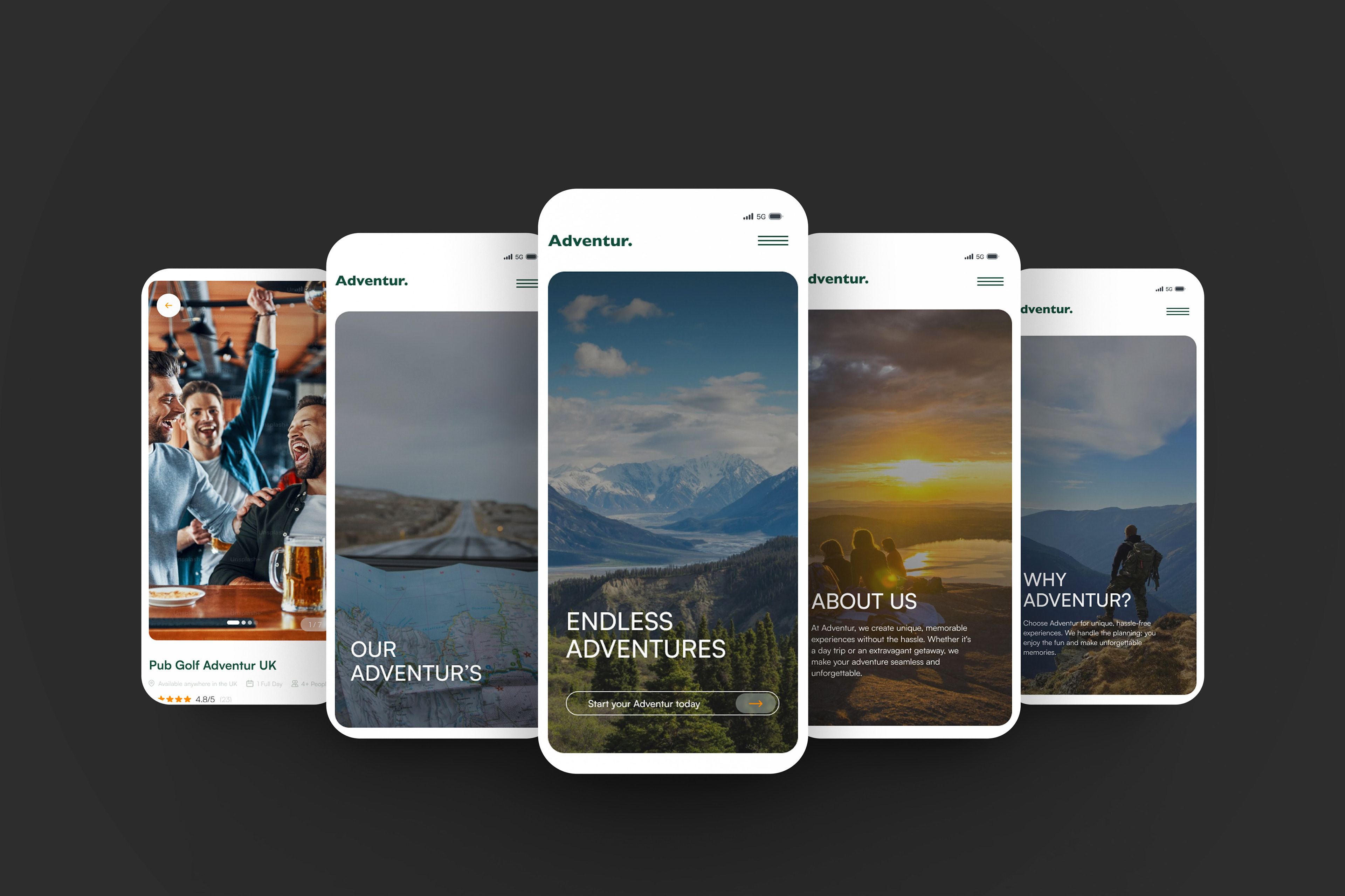
The success of "Adventur" stemmed from comprehensive research into current trends and competitive analysis. This informed each phase of the design process, resulting in a bold, user-centric, and highly intuitive experience.
Adventur's design prioritised usability, integrating intuitive navigation and streamlined booking to ensure effortless adventure planning, enhancing the user experience and establishing it as a travel industry leader.
A consistent style guide ensured seamless design across mobile and desktop, maintaining uniformity and coherence across all pages throughout the design process for 'Adventur'.
A simple, bold color palette and clear sans serif typeface complemented Adventur's brand identity, appealing to the younger target demographic and enhancing overall visual coherence.

