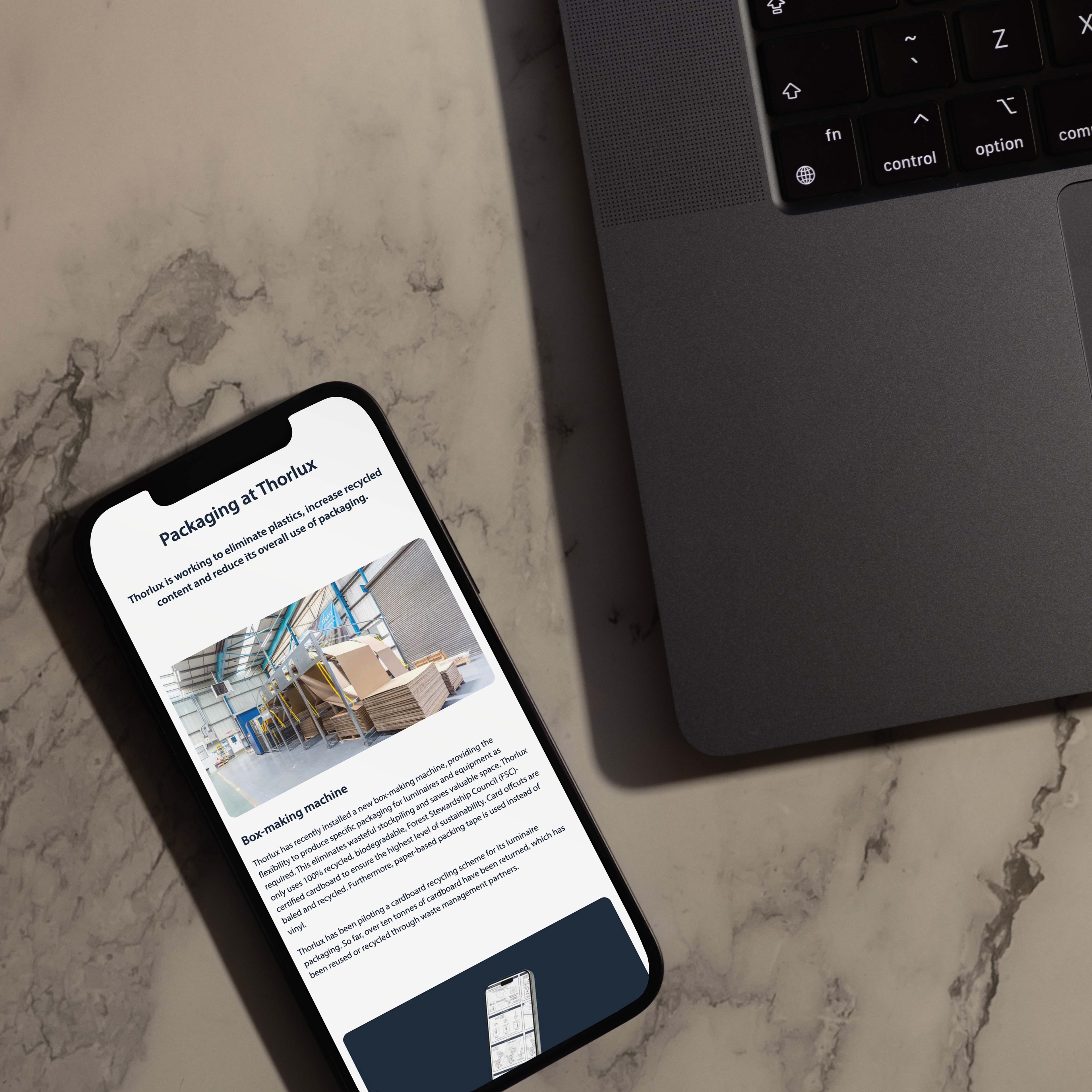
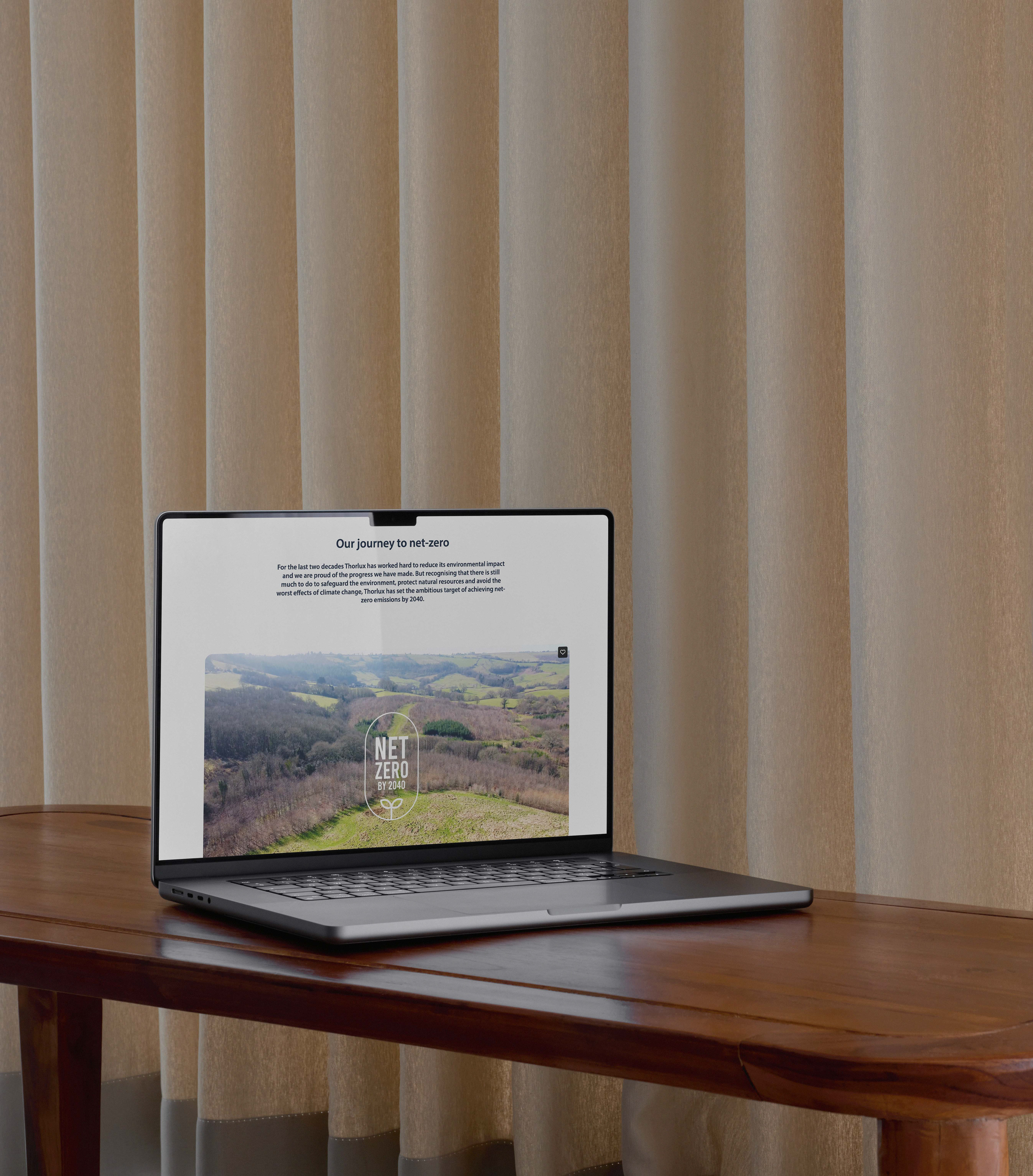
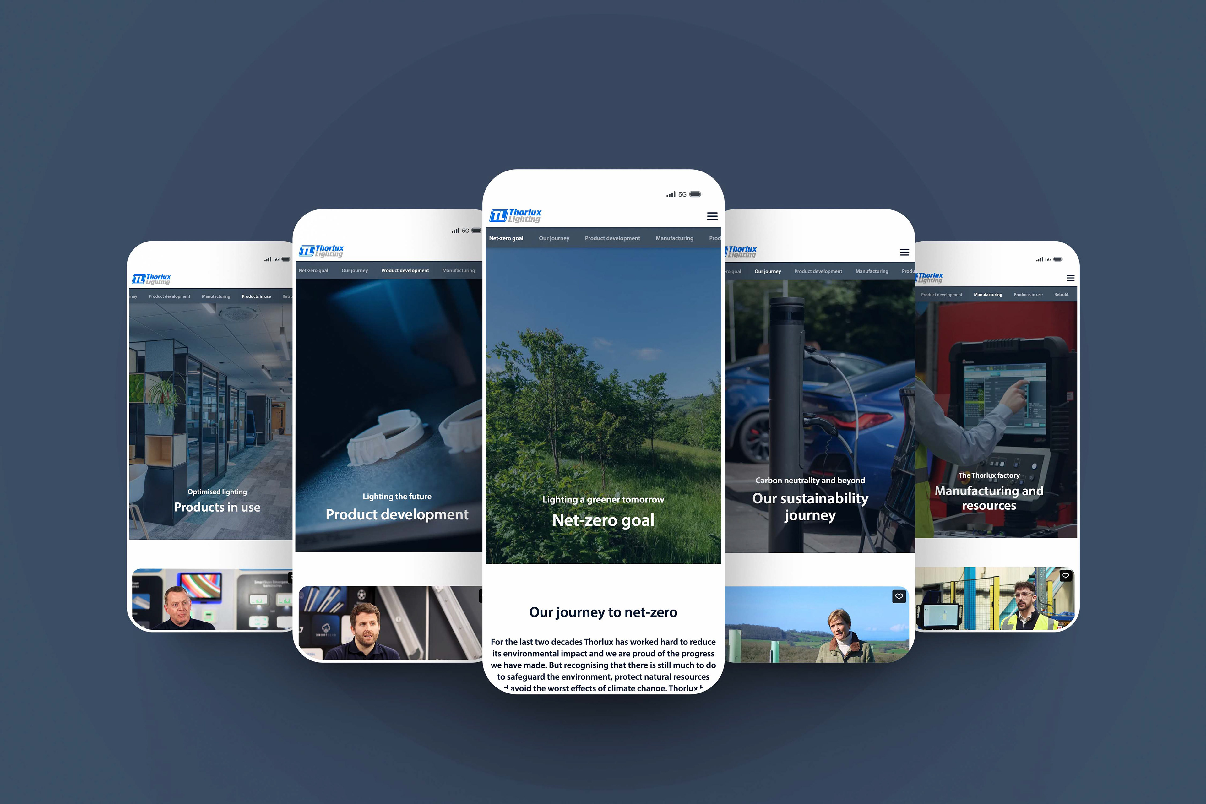
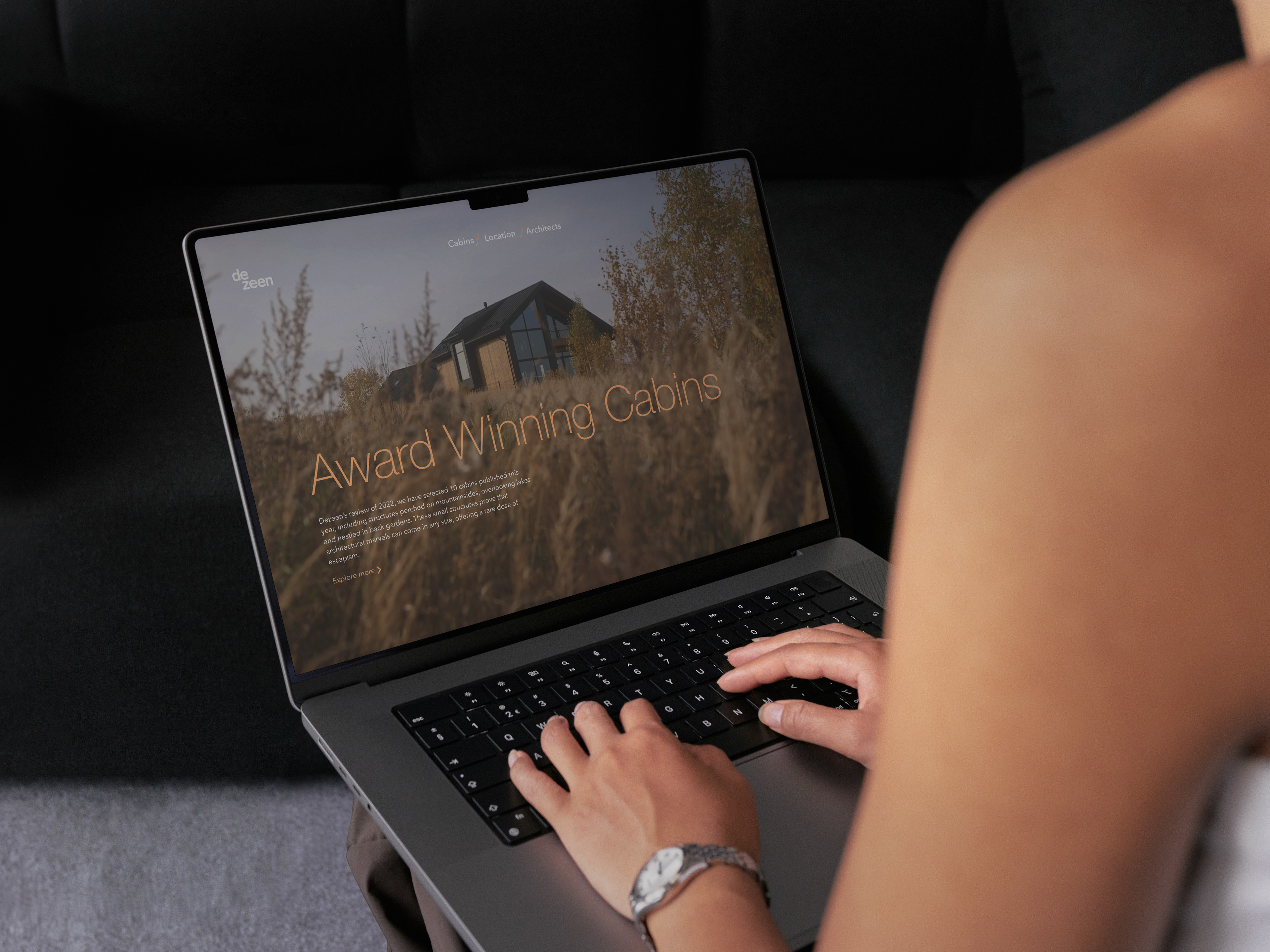
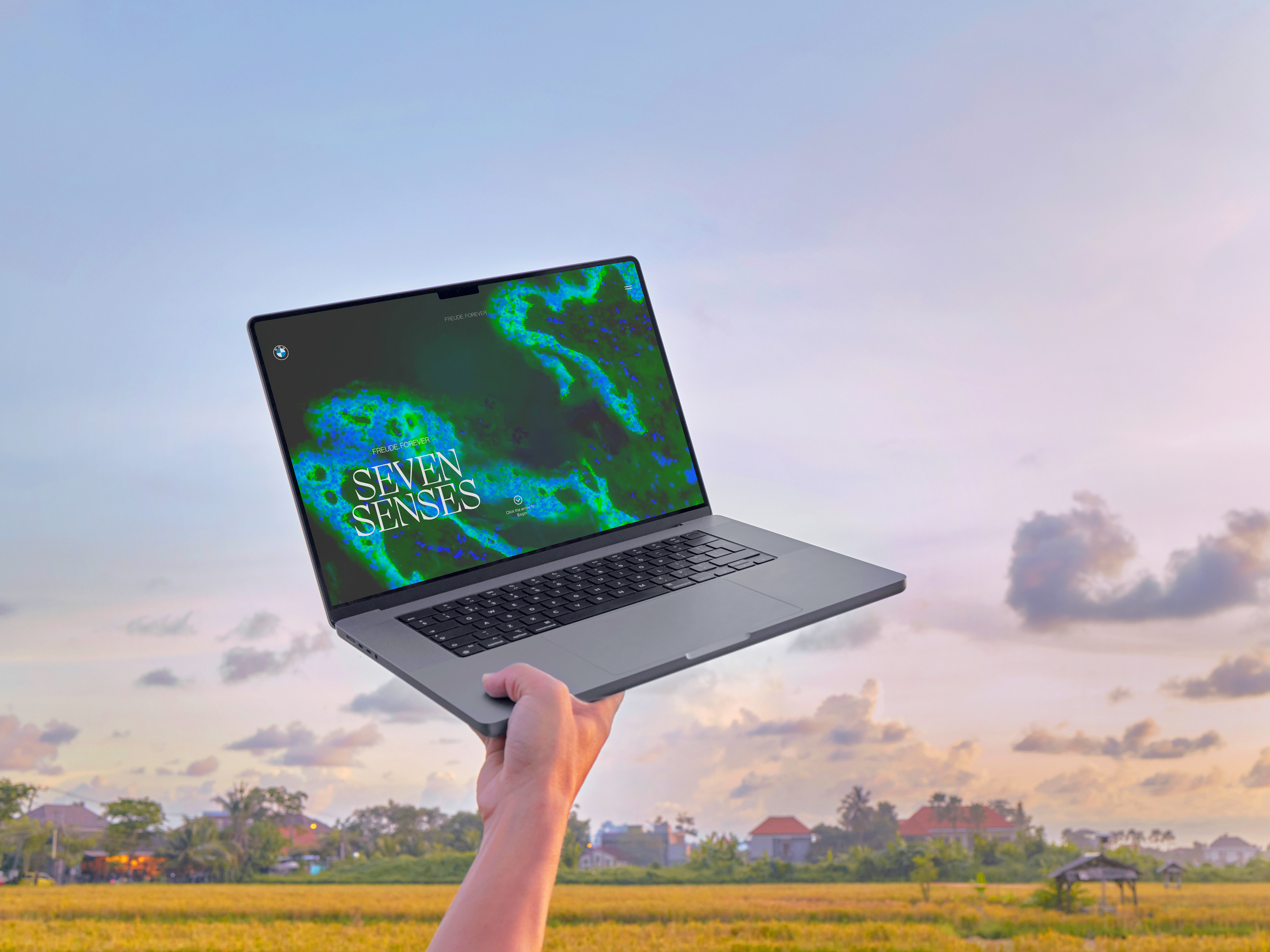
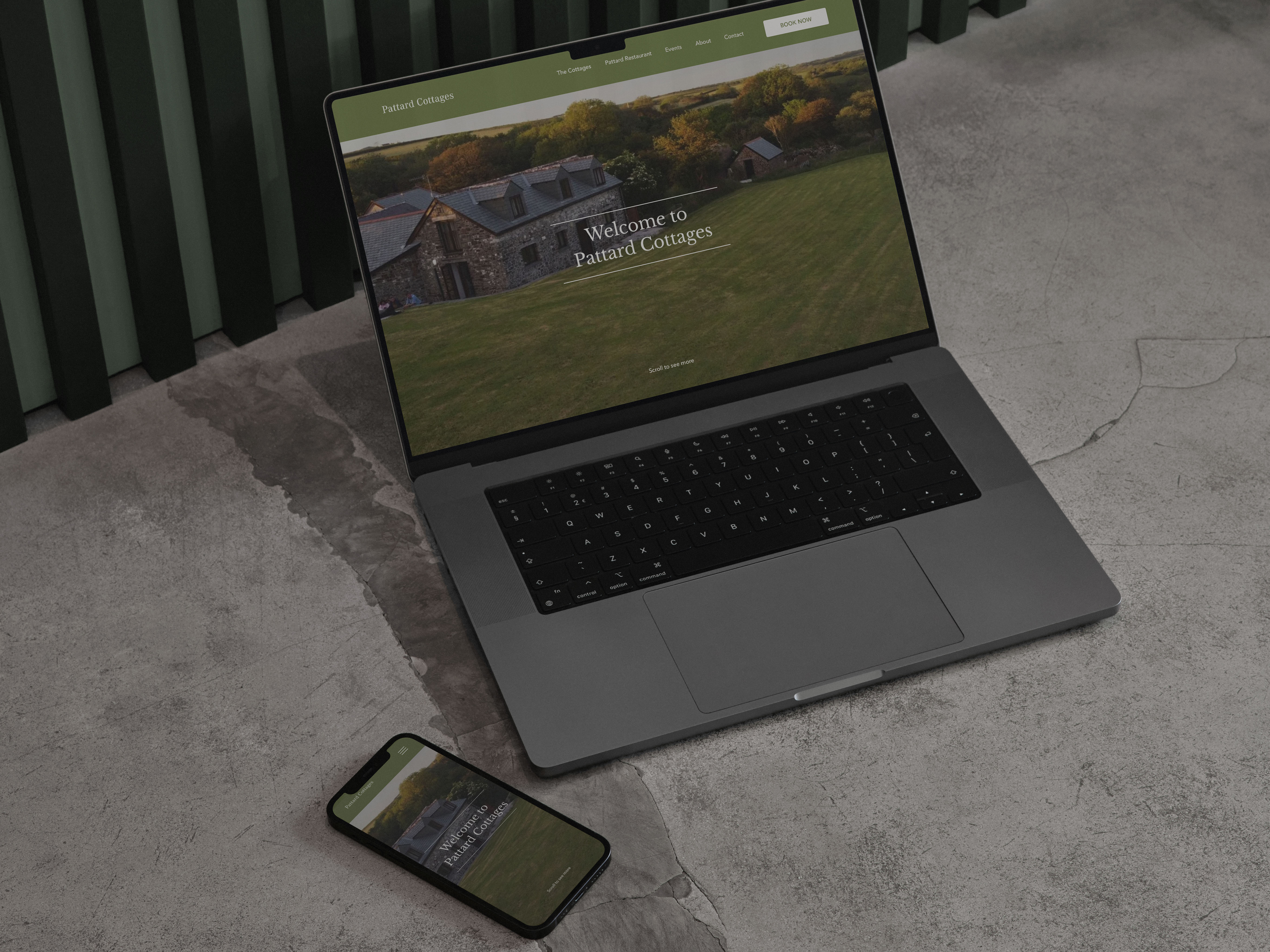
The Thorlux Lighting sustainability section was created to make their environmental efforts clear and easy to understand while engaging visitors with meaningful content.
The Context
Thorlux Lighting is a renowned lighting company specialising in the design, manufacturing, and distribution of commercial lighting solutions globally. In this project, I led the creative development of a new sustainability section for their updated website. This initiative comprised six distinct sections, each accompanied by an interview video that I produced and edited to complement the written content.
Throughout this project, I collaborated closely with the marketing manager, creative director, and senior designer. As the lead designer in this project, I was responsible for crafting a series of designs, backed by research, to ensure a deep understanding of the meaning behind each section and its contribution to Thorlux’s sustainability message.
Website
Tools
Figma
Photoshop
Premier Pro
Duration
6 Month Duration
The Solution
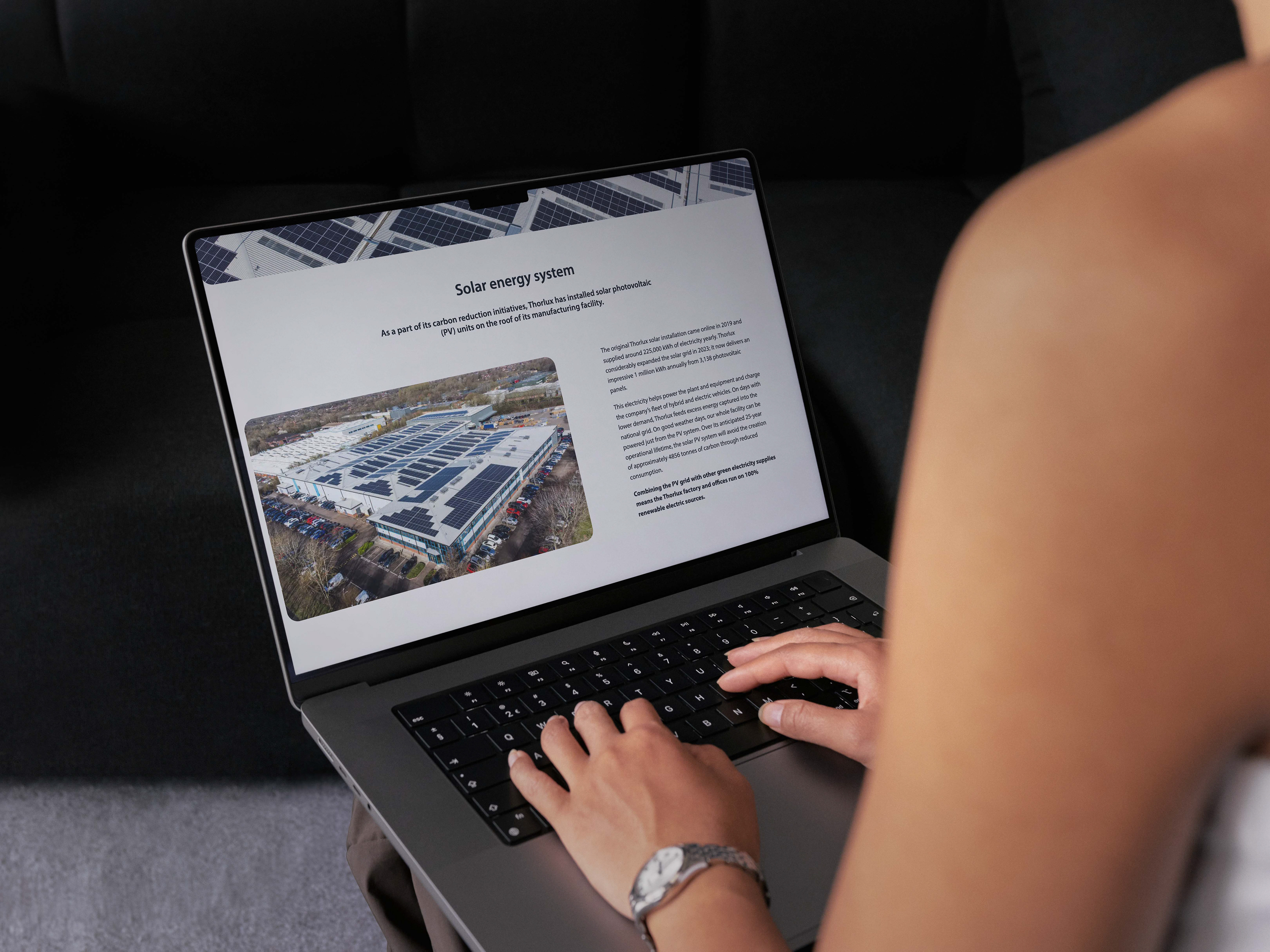
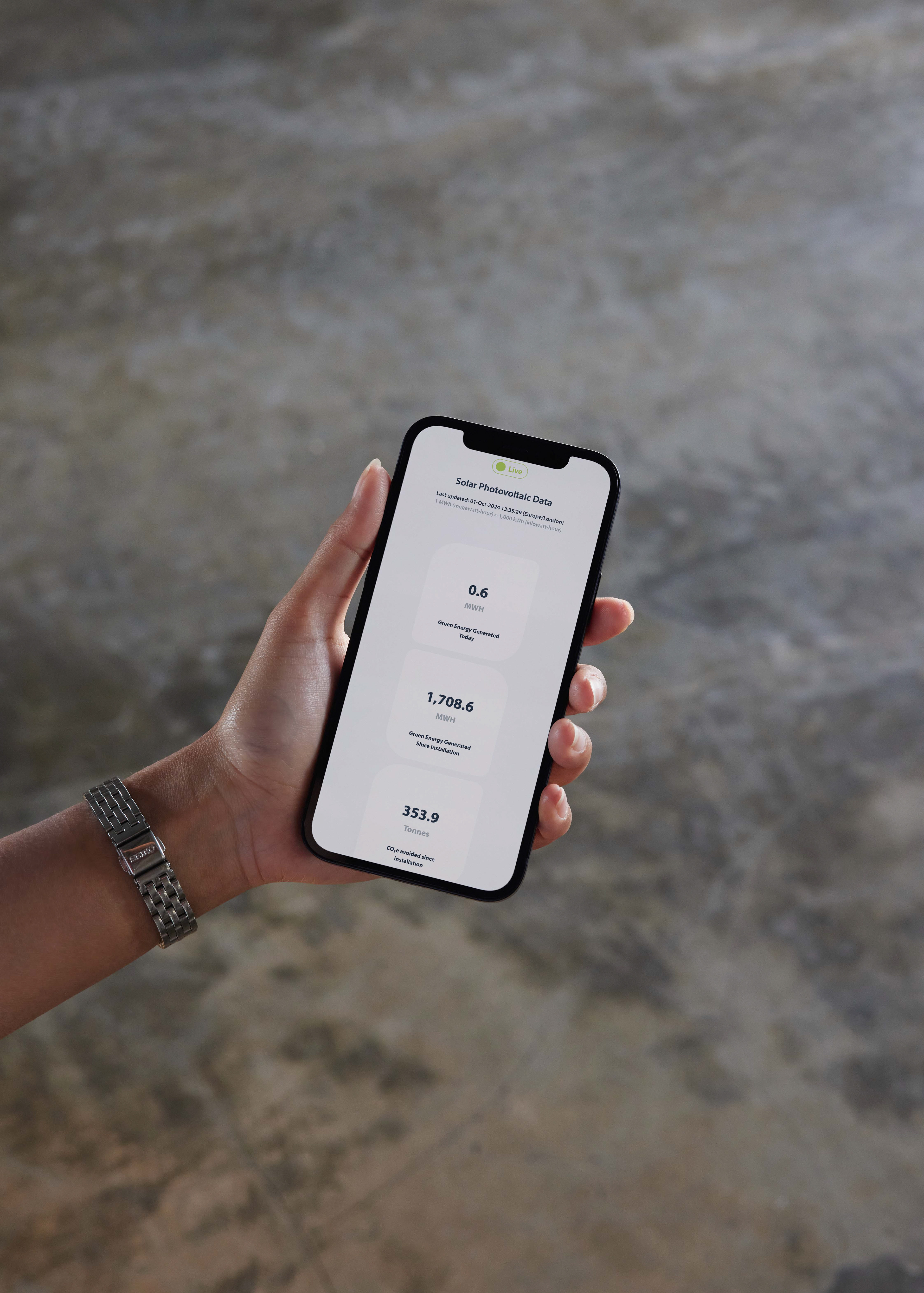
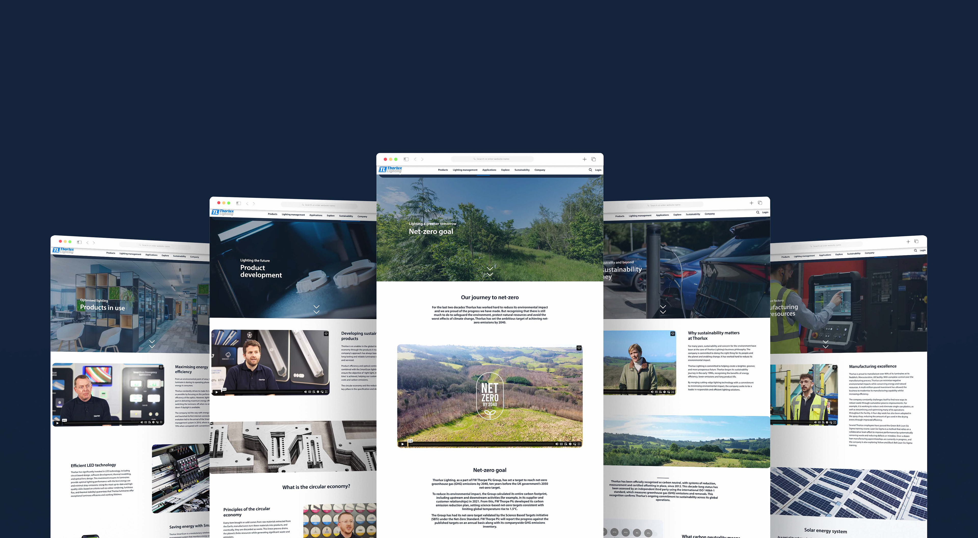
My design strategy was centred around simplicity, ensuring that the formal nature of the subject matter allowed the content to take centre stage. With usability always front of mind, I structured the sections to be clear and easy to navigate, while maintaining a consistent and clean aesthetic in line with Thorlux’s overall design language.
Leveraging the capabilities of Figma, I created content-rich sections that are easy to read and digest. While maintaining a sense of uniformity across the sustainability sections, I introduced slight variations in the layout to create differentiation, ensuring each section feels connected but distinct in its focus.
In addition to the design of the sustainability sections, I also led the creation of six accompanying videos, which offer further insight into various sustainability topics. These videos were a key feature of the project, and I oversaw their storyboarding, production, and editing. The final videos effectively communicate the key messages and were a valuable addition to the overall presentation.
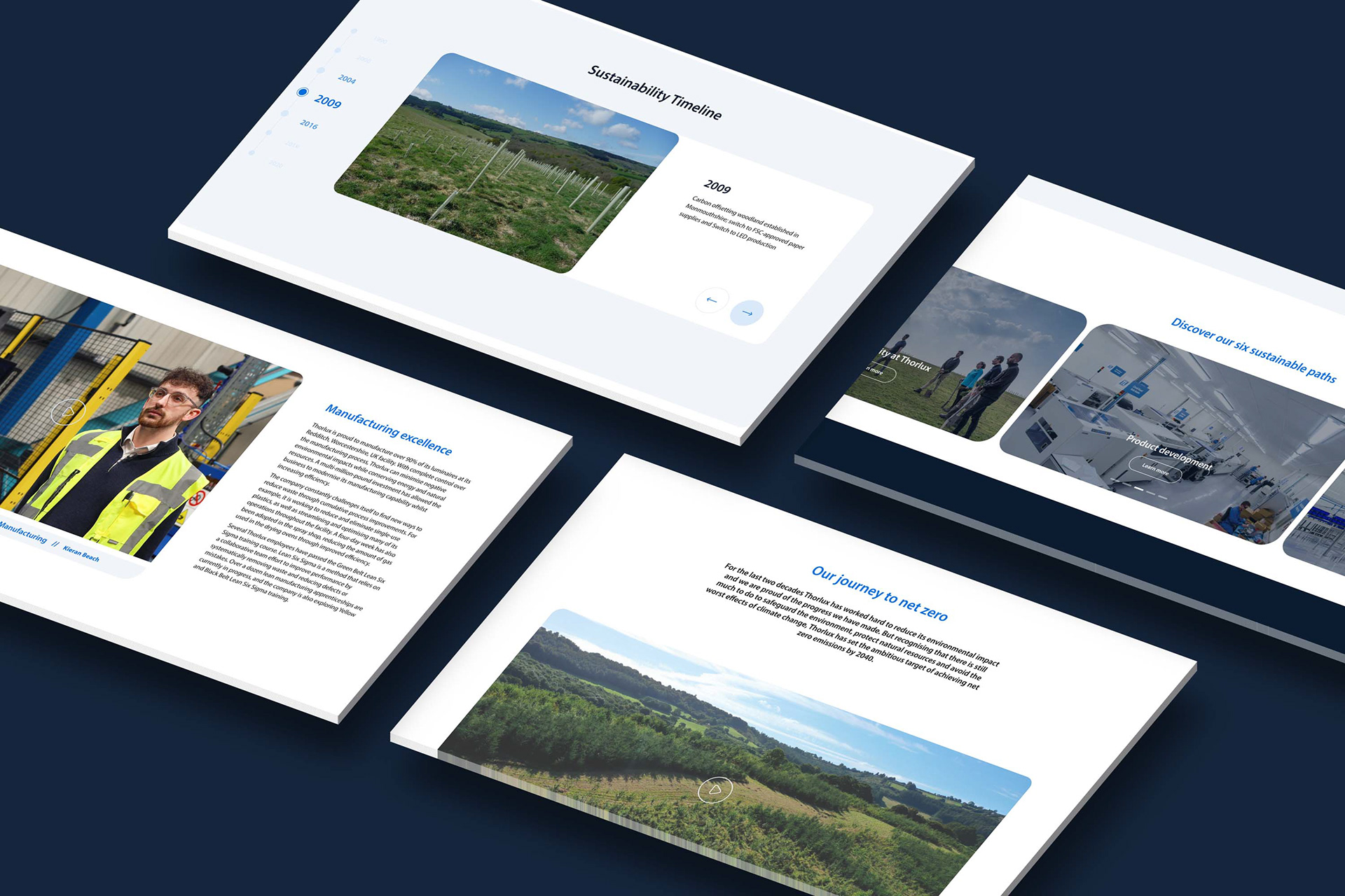
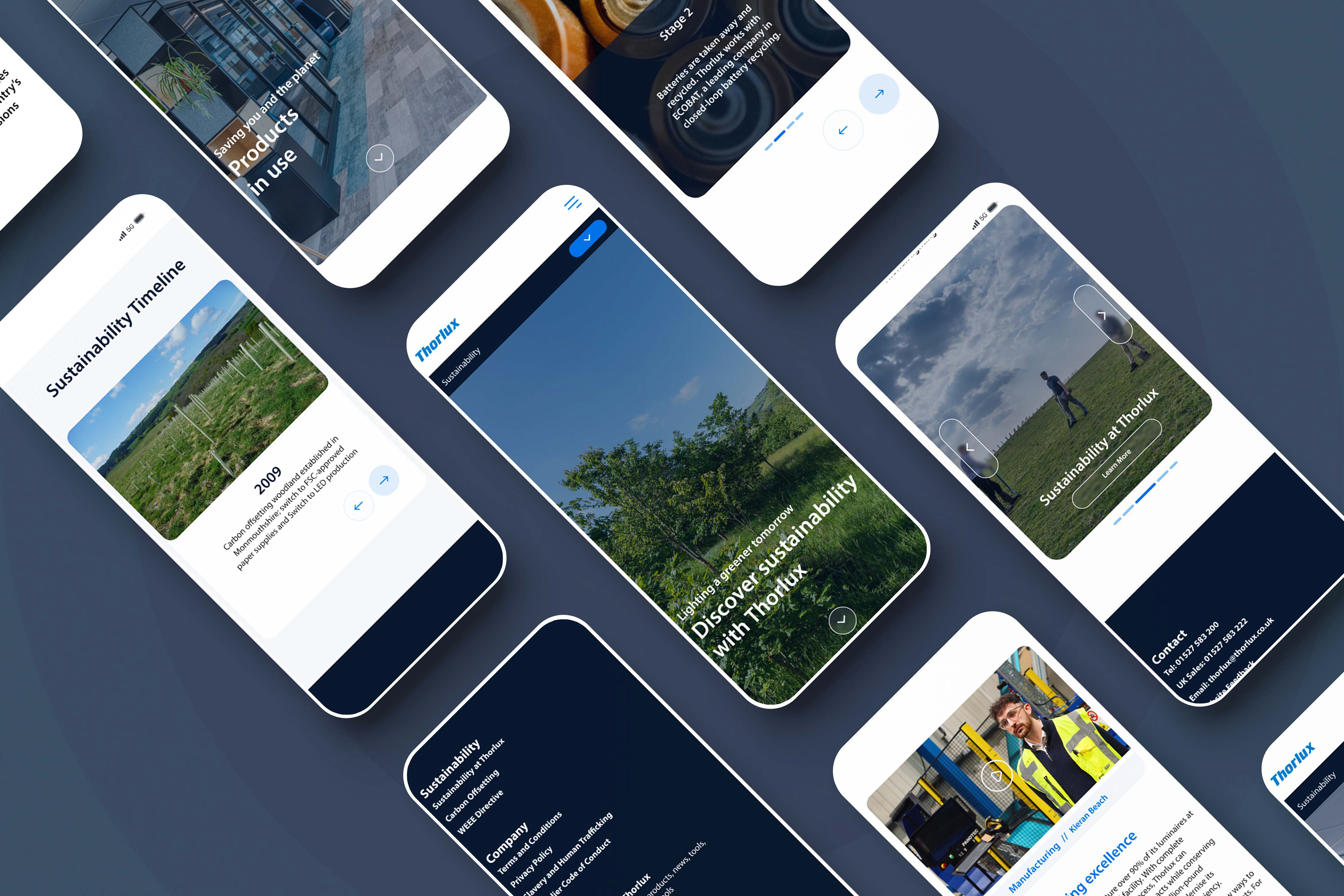
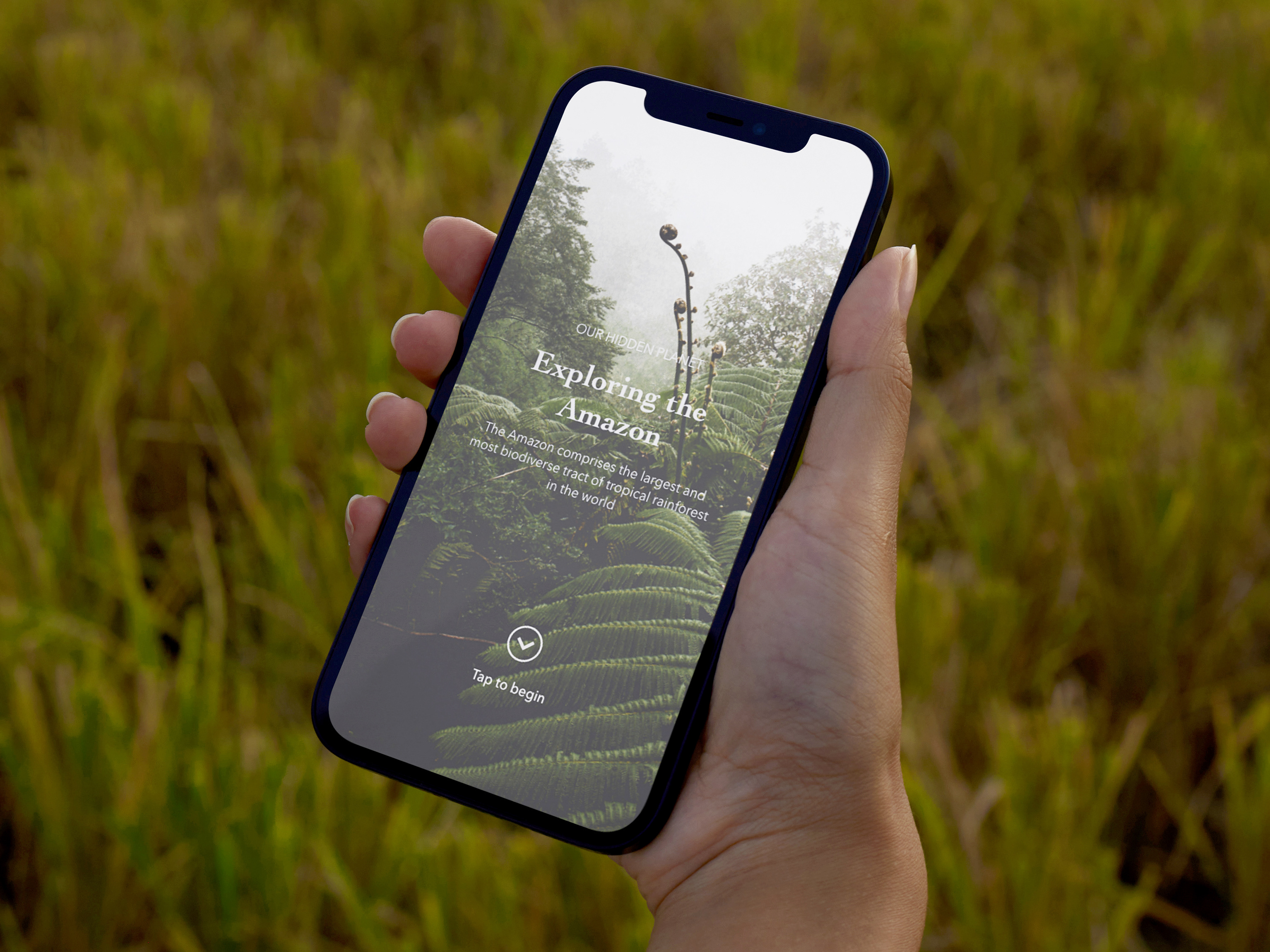
Designs from Figma I would have liked to be developed
The Review
While I am satisfied with much of this project, I was not able to be involved in the full development process, which led to some areas being implemented differently from my original vision. There are elements I would have liked to refine further to achieve the exact look and functionality I intended. Nevertheless, I am pleased with the overall result, particularly the successful integration of six comprehensive sections and six supporting videos that clearly convey Thorlux’s sustainability efforts.
